Slope of Hope Blog Posts

Slope initially began as a blog, so this is where most of the website’s content resides. Here we have tens of thousands of posts dating back over a decade. These are listed in reverse chronological order. Click on any category icon below to see posts tagged with that particular subject, or click on a word in the category cloud on the right side of the screen for more specific choices.

Various Markets; Weekly Views

By -

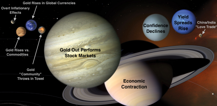
It occurs to me that in public writing I tend to bludgeon people with macro fundamentals (like gold vs. positively correlated markets, yield relationships and even confidence in global policy makers), market indicators (VIX, Equity Put/Call, Gold-Silver ratio, Sentiment, Participation, etc.) and other views beneath the surface of things. So much so that I sometimes forget that people might like to see simple nominal charting as a frame of reference.

We update charts like these every week in NFTRH, but I have done relatively few for public review. So here it is, a simple weekly chart update of various markets, with very limited commentary interference from me.

US Stock Market (more…)

Fed’s Bag of Tricks: Op-Twist 2?

By -

Yesterday we reviewed the Scariest Chart in the World, an overly sensational tongue in cheek title for a chart that has bearish historical implications for the S&P 500. Here it is again. Whether the Fed is looking at this exact combination of data points or something similar, you can bet they are aware that things have come to the brink. The spread in the bottom panel is trying to turn up and that condition has not worked well for the stock market on the last two cycles.

30-5 yield, SPX and t bills

(more…)

The Scariest Stock Market Chart in the World

By -

The title is a paraphrase of “the scariest gold chart in the world” (target below $400) someone sent me in 2009, just before the gold price began its $900 per ounce upward journey. So that’s the contrarian caveat and indeed, I hesitate to write bearish things at a time when small speculators are way too short the market and everybody already seems to know how bearish things are.

But the chart is the chart and without further ado, meet the scariest US stock market chart in the world. I was ready to try a long on the SPY yesterday, but decided to wait because of this (being posted here because it never made it into NFTRH 381’s already bloated 42 pages) chart and some others in the face of which I just could not rationalize a bullish stance. Capital preservation is job 1 now, not bullish speculation. I’ll let the bulls prove something first.

spx, irx and 30-5 yield spread, stock market, bond market

(more…)

Macro Changes

By -

The following is the opening segment of this week’s edition of Notes From the Rabbit Hole, NFTRH 381…

A picture is worth 4-plus years and thousands of words, and the picture below has a lot to say. I’ll say some words as well, since I have kept them bottled up for years in an effort to make sure we operate with discipline as opposed to gold bug style emotion.

The bear market and subsequent inflation-fueled credit bubble early last decade was when I first started paying close attention to macro markets (as opposed to stock trading, which I had done for a few years prior) and how they operate. Having seen well paid professionals lose half of my IRA in 2002, I took over all of our finances and never looked back. But I needed to understand how markets worked and that has been a challenging and rewarding endeavor, not to mention an ongoing learning experience.

(more…)