Shown on the right-hand side of the daily chart of the S&P 500 E-mini Futures Index (ES) is a TPO Profile. It represents trading activity over a period of time at specified price levels and is shown in vertical histogram format (dark blue). Its outer edges at the top and bottom are defined by the two yellow lines. The longest row of the TPO defines the price level that was hit the most during the specified time period. This level is called the POC (Point of Control) (pink line). The price range surrounding the POC where 70% of the trading activity occurred is called the Value Area (area in between the two turquoise lines).
(more…)Slope of Hope Blog Posts
Slope initially began as a blog, so this is where most of the website’s content resides. Here we have tens of thousands of posts dating back over a decade. These are listed in reverse chronological order. Click on any category icon below to see posts tagged with that particular subject, or click on a word in the category cloud on the right side of the screen for more specific choices.
Tesla: February 2020 Insider Buys
U.S. Stock Market & Sector Performance Heatmaps
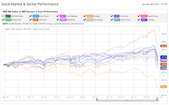
The following graph and heatmap are provided courtesy of Barchart.com.
The following percentage graph shows a 1-year comparison of the S&P 500 Index with the S&P Sectors. You can see which Sectors are outperforming or underperforming the Index.
China’s Shanghai Index At Its Tipping Point?

US10YT Drops To A New Low
I last wrote about US 10-Year Treasury Yields in my post of August 16, 2019, which warned of potential upcoming weakness in the equity market. It was trading at 1.556.
Since then, it rose to a high of 1.952 in December, reversed course sharply in January, and has plunged to an all-time new low of 1.254 as of 2:15 pm ET today (Thursday), as shown on the following Monthly chart, as equity markets reached a 10% correction level this morning.
The big question is, is this capitulation or is it a warning of further equity weakness?
(more…)