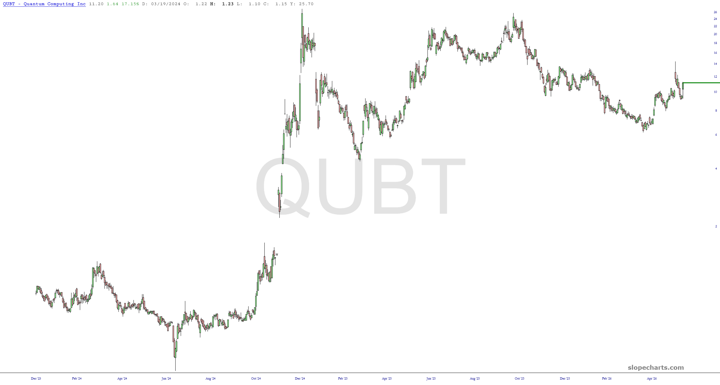
Our $40 trillion-in-debt government has decided to invest billions of dollars in highly speculative quantum computing companies, goosing their prices by about 20%, more or less.
Slope initially began as a blog, so this is where most of the website’s content resides. Here we have tens of thousands of posts dating back over a decade. These are listed in reverse chronological order. Click on any category icon below to see posts tagged with that particular subject, or click on a word in the category cloud on the right side of the screen for more specific choices.
Our $40 trillion-in-debt government has decided to invest billions of dollars in highly speculative quantum computing companies, goosing their prices by about 20%, more or less.
You wouldn’t know it, but I’ve been quite ill for a week now. I think I’m getting healthier, but yesterday evening my wife took this candid shot of me on the deck with my constant companions. As bad as I felt, this is pretty much all I’ve ever wanted.

We all know the old saw, “Fool me once, shame on you; fool me twice, shame on me.” I’m not so sure it applies anymore.
The market has been fooled at least a hundred times so far regarding this war and its deal-almost-done-just-wait-a-bit nonsense. It’s no surprise they keep trotting out the same tired old delays, because they work every single Taco Tuesday. This morning, a little reality is creeping in once more.

With a baseball bat, evidently……….

