Slope of Hope Blog Posts

Slope initially began as a blog, so this is where most of the website’s content resides. Here we have tens of thousands of posts dating back over a decade. These are listed in reverse chronological order. Click on any category icon below to see posts tagged with that particular subject, or click on a word in the category cloud on the right side of the screen for more specific choices.

Group Think (by Runedge)

By -

The problem with group think is that thinking is not allowed.  It should really be called group acceptance. The larger the group the harder the tendency for someone to disagree.  Right now the group is massive. The group think I am referring to is with the Fed, the Bernanke put and how the Fed will "just print more money and bail out the banks."

I have yet to read the Art Of War (have owned it for about 15 years now) but somewhere in there I am sure it talks about giving your enemy more credit and not simply labeling them as stupid or inferior.  The Fed is a smart group of people, albeit lacking in practical real world business sense.  The banks are benefitting for sure from playing the role of broker as the Fed expands its balance sheet.  How else can the Fed buy treasuries though?  We know they are monetizing the debt but at least by working through the primary dealers they can say they are not monetizing the debt.

There are three ways to grow nominal GDP

M (money supply)  x  V (velocity) = Q (output)  x  P (price inflation)

1 – Increase the money supply

2 – Increase the velocity of money

3 – Increase inflation

Let's use an example of a place called Fantasy Land (fitting for our current situation).

A farmer sells $50 in corn to a neighbor.  The farmer then spends $30 to get their tractor fixed from another neighbor and spends $20 on a bottle of moonshine at the local "packy." 

The GDP of this fine community is $100 assuming their is no inflation (hence the name Fantasy Land). Using the above formula we have:

Money Supply ($50) X Velocity (2, how many times the money was turned) = Inflation (0%) X Output ($100)

Getting back to Fantasy Land, excuse me the US economy, banks are not lending and people are not spending.  There is NO demand, so there is no velocity.  Money is not turning over.  Small business surveys continually state that their top concern is not lack of credit, but rather lack of customers.

So the Fed must grow the monetary base (even though Banana Ben has said they are not creating money). Look at the two charts below of money supply and velocity.  They have offset one another causing no real GDP growth, only nominal.


Screen shot 2011-01-09 at 3.14.24 PM


Screen shot 2011-01-13 at 7.58.05 PM


The Fed through QE is trying to make money so cheap it creates demand through inflation expectations (that car will be more expensive next month so I'll buy it today) and overall demand (I'll remodel that basement because Home Depot has zero interest rates for 18 months).  

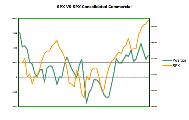
Problem is it's not working.  Demand is not there.  The Fed is hoping QE will raise stock prices, which obviously has worked and give people a sense of wealth, a desire to spend.  It's also caused yield chasing and the use of massive leverage (leverage is now back to LEH levels which is truly astonishing).  

Commodities have been a great trade and people have piled in.  The result is rising input costs which cannot be passed along because there is no demand.  As input costs rise margins are compressed. Expect higher layoffs as firms do all they can to manage the bottom line.   Bernanke's efforts seems to be choking any demand left in the economy. 

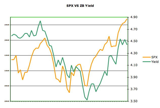
Input costs have risen,  treasury yields have risen, gas at the pump has risen and now the USD has begun to catch a bid.  The market looks forward to QE3 but honestly Banana Ben may not have the opportunity to see that happen.  The debt ceiling will be reached in less than 8 weeks and in a recent survey 70% of Americans do not want it raised.  Sure Congress can do what they want, they have done so for years. But, the last election has taught many that if they want to keep their jobs they better listen.  The bond market may be telling them the credit card is stopped.  We see what's happening in the municipal bond market.  

A former Atlanta Fed President has publicly called out the Fed, their QE and their solvency.  Dallas Fed President Fischer has also publicly cast his no vote for further QE beyond June.

Just recently two regional Fed manufacturing surveys were revised downward.  QE is not working other than wealth effect which is not driving demand.  Bernanke is not a dumb man. He lacks business sense for sure but at some point the Bernanke put will expire.  To think the Fed will always be there is a clear sign group think is wrong again.

Submitted by Runedge.  If you would like to follow my blog please visit - Ultra Trading

Comparisons to the April 2010 Top (by Runedge)

By -

We've all been studying charts trying to find any sign of price finally breaking for some sort of a correction. The longer this market rallies without a correction the larger that correction should be. Before digging into the chart below, few points need to be realized in understanding what is underneath this current market:

Leverage is back to LEH levels which can exacerbate selling as margin enhances losses and causes phone calls from brokers.

Bullish ratios have been above historical highs (and bearish below historical lows) for weeks on end now.

Insiders continues to sell at the 100 plus to 1 ratio versus buyers and it's been going on for months now.

Money continues to flow out of domestic equity funds. We are on about 37 weeks with only one minor inflow at year end 2010 (working from memory but think the inflow was less than 1 billion).

The VIX has bottomed and matched the prior lows of the May correction.  Note it bottomed two weeks before the SPX topped.  There was an interesting read on Zero Hedge about the VIX in some sense not being very cheap.  It was based on the fact that realized volatility has been very low (not a lot of volatility when markets just go up and up).

Let's look at the chart of the SPX and see some comparisons to the prior sell off in May 2010 (which seems like an eternity now).

Notice the bearish divergence on the MACD through the entire rise off the Feb low to the April high (lower MACD levels while SPX price was rising).  Very similar divergence to the current rally.

Notice how long the slow stochastic stayed overbought in the Feb to April melt up and how it compares to the current melt up.

Orange horizontal lines on the current melt up are the gap fills that need to be filled at some point. There are seven that I count.

Notice in both melt ups how price hung on the upper bollinger band for most of the move.  The SPX has not touched the lower bollinger band since 8/25 (almost 5 months ago).

The May high was exactly 135 points above the 200MA on that day.  Today's closing price was exactly 135 points above the 200MA today.

Notice the candlestick pattern inside the two orange boxes.  Fairly similar price action.

Screen shot 2011-01-12 at 9.40.29 PM

Submitted by Runedge.  If you want to follow my blog please visit - Ultra Trading

COT Report Week Ending 1/4

By -

Normally the COT report comes out every Friday for the prior week ending on Tuesday but with the holidays of late the reports have been coming out on Monday, hence the double COT report this week.  In the prior post I mentioned how it looked like based on commercial traders positions in oil, copper and the long bond that the SPX could in fact be ready to turn here.  The data still supports that as shown in the following charts:


Chart 1 – 30 Year Treasury Price VS 30 Year Commercial Net Position


Traders continue to main a more short position implying coming bond strength (higher price lower yield).  Check out Chart 2 below for a comparison on S&P 500 VS 30 Year Bond Yield.


Chart 2 – 30 Year Treasury Yield VS S&P 500


Chart 3 – S&P 500 VS Copper Commercial Net Position


Copper correlates very closely as shown in last week's charts with the SPX.  Looks like commercial traders are continuing to trade around lower copper prices or at least less strength.


Chart 4 – S&P 500 VS Oil Commercial Net Position


Oil correlates nicely with the SPX although lately not as well as copper.  Regardless, similar to the position in copper, commercial traders look to be positioned around coming oil weakness.


Chart 5 – S&P 500 VS S&P500 Consolidated Commercial Net Positions


Honestly, not sure how much you can read into week to week changes here but the charts do somewhat correlate.  What's standing out is the broad divergence right now.  Would imply SPX weakness.


Submitted by Runedge.  If you would like to follow my blog please visit - Ultra Trading

Weekly Commitment of Traders Report – Week Ending 12/28

By -

For about six months now I have been downloading the weekly CFTC report and crunching the numbers into an Excel spreadsheet.  It's been more educational in terms of how certain markets work but as I understand these reports more I am realizing there is a lot of good data to be had.  For those new to the COT report, traders are categorized into three categories Commercial, Non Commercial, Non Reporting. Commercial traders for example would be Starbucks buying coffee for delivery through the futures market.  These are the traders that know what's going on and the ones where the most can be gained by studying their positions.

So the charts below focus solely on the commercial traders and their net position (long minus short).

Chart 1:  S&P 500 Versus Copper Commercial Positions.

For sake of comparison, I often invert an axis as I did on the left side which represents the net position). The prior week registered the highest short position of commercial week and this week we see them finally to have reduced that position.  It's not definitive enough at this point to declare an overall change in copper price action but considering the strength in copper, why would commercial traders drop their net short position.  Commercial traders short into strength and go long into weakness.

Screen shot 2011-01-05 at 4.09.06 PM

Chart 2:  S&P 500 Versus Copper.  

I show this chart for the simple fact of showing how tightly correlated the two have been.  The past 6-8 weeks they have traded with almost perfect correlation.  Copper has begun to rollover the past few days.  It's worth noting price action over the next few days to see if the slide continues or not.  

Screen shot 2011-01-05 at 4.09.36 PM

Chart 3:  S&P 500 Versus S&P 500 Consolidated Commercial Positions

Notice the relatively strong correlation the past year.  It's not as tightly correlated as Chart 2. Notice the April high (peak on the SPX – orange line) and how it was trading higher than the green line until it reverted.  Notice what's been happening the past few weeks as the two have once again diverged. Would imply the SPX is due to correct as it did in April 2010.

Screen shot 2011-01-05 at 4.12.05 PM

Chart 4:  S&P 500 Versus 30 Year Treasury Commercial Positions

Similar to Chart 3, notice how the net position has begun rolling over while the SPX has continued to diverge?  

Screen shot 2011-01-05 at 4.14.25 PM

Chart 5:  30 Year Treasury Yield Versus 30 Year Treasury Commercial Positions

Notice how the commercial traders have been increasing their short position (axis on the right inverted for comparison) while the 30 year yield has diverged.  This would imply the 30 year is close to a bottom in price (high in yield) and due to begin catching a bid which based on correlations would put pressure on the SPX (see chart 6).

Screen shot 2011-01-05 at 4.16.46 PM

Chart 6:  S&P 500 Versus 30 Year Treasury Yield

Screen shot 2011-01-05 at 4.41.13 PM

 Submitted by Runedge.  If you'd like to follow my blog please visit - Ultra Trading