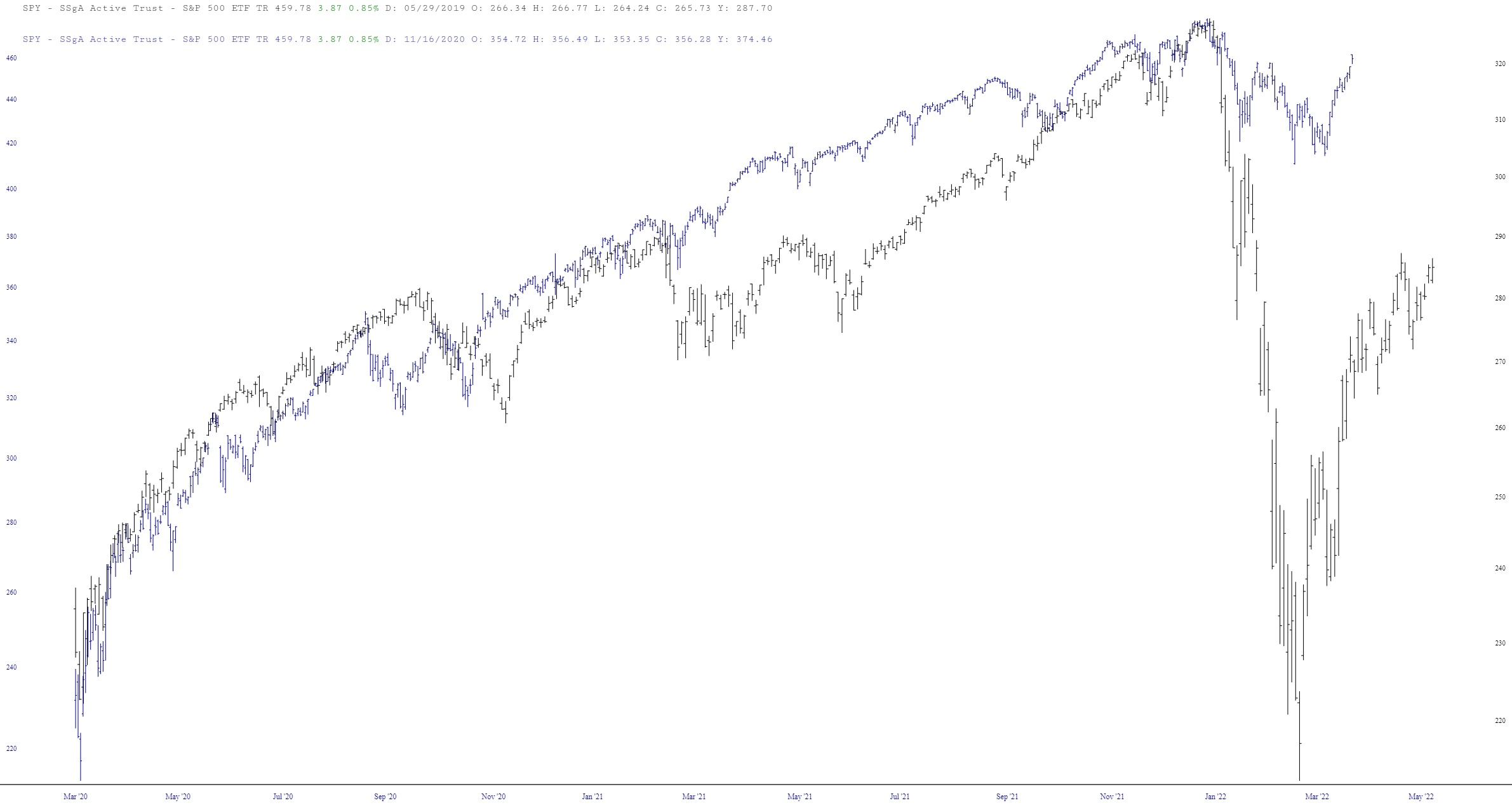
I’ve seen in mentioned that Q1 2022 was the same as Q1 2020 – – that is, a hard, fast selloff followed by a V-shaped recovery. Well, yes, I can certainly see the similarities. But I do want to point out one key difference by way of layered charts:
Slope initially began as a blog, so this is where most of the website’s content resides. Here we have tens of thousands of posts dating back over a decade. These are listed in reverse chronological order. Click on any category icon below to see posts tagged with that particular subject, or click on a word in the category cloud on the right side of the screen for more specific choices.
I’ve seen in mentioned that Q1 2022 was the same as Q1 2020 – – that is, a hard, fast selloff followed by a V-shaped recovery. Well, yes, I can certainly see the similarities. But I do want to point out one key difference by way of layered charts:
Well, I wasn’t planning to write a post, but I was studying tonight and thought this was good enough for at least a quick post to take some of the posting weight off ‘ole Tim’s shoulders.
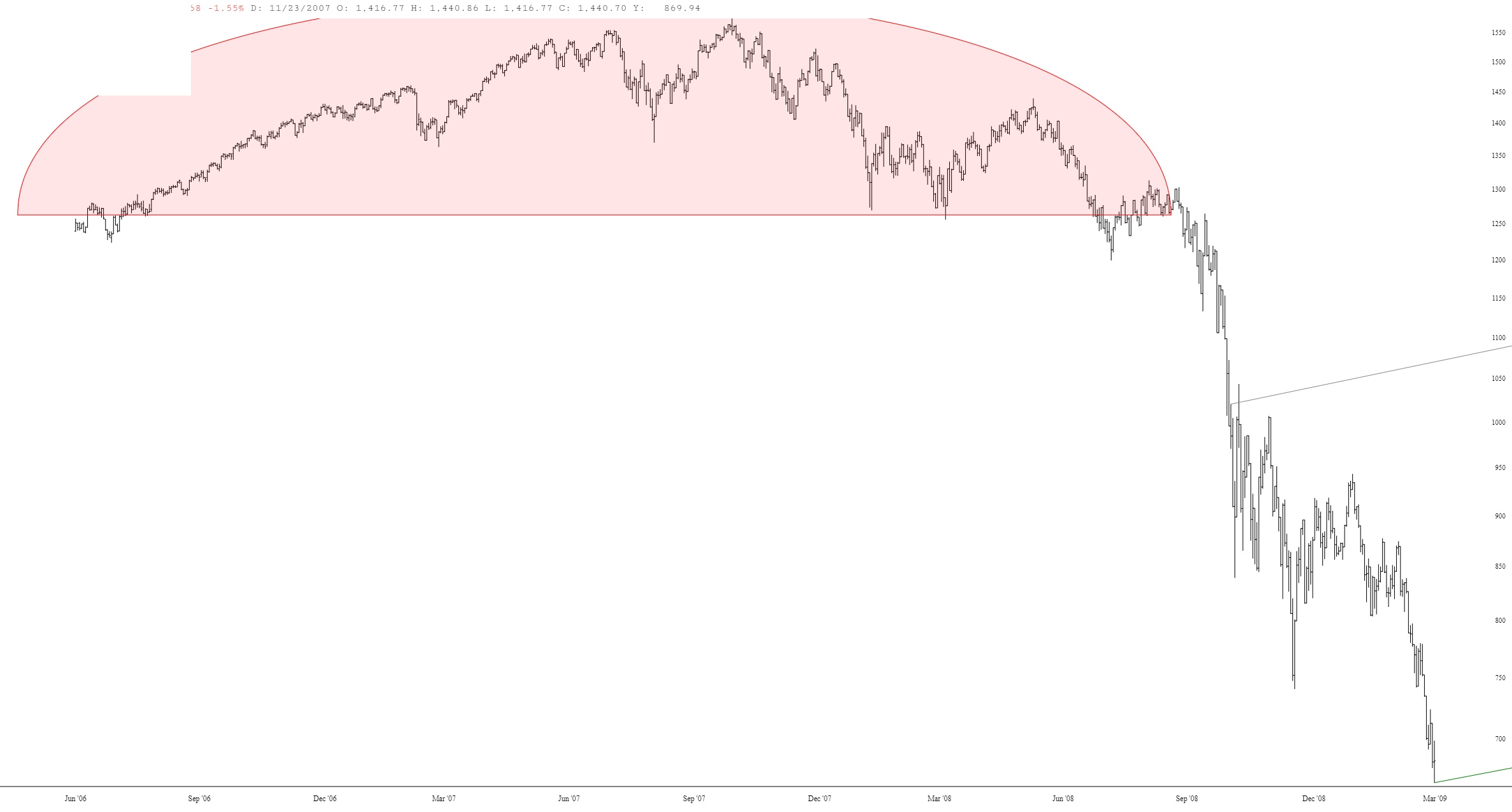
I specifically went looking for any portion of the 2000 or 2008 bear markets that formed a daily falling wedge and I found one indeed at the beginning of the 2000 bear market.
I was looking for a case where the weekly band was being repeatedly hit and overthrown (as is typical in an actual bear market rather than a corrective period) with competing trend lines narrowing into a falling wedge over months of trade.
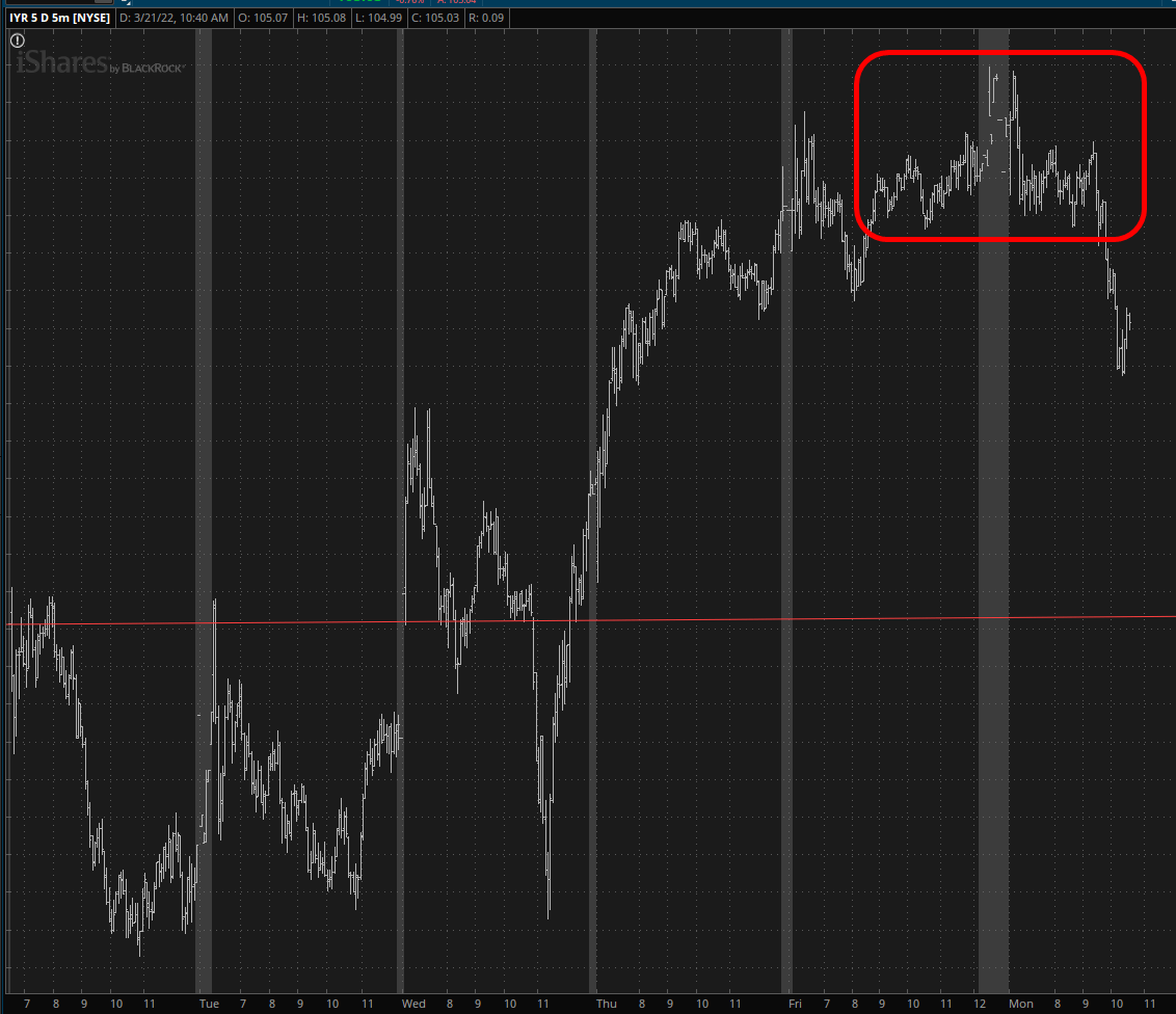
(more…)I’ll stop with my stupid victory laps and say once again that the real estate analog, symbol IYR, is still super-dee-dooper. I’ve done my best to mark a “you are here” type arrow.