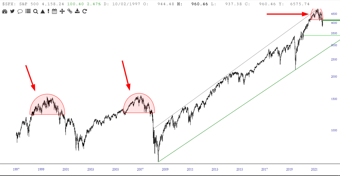
That ’70s Show

Slope initially began as a blog, so this is where most of the website’s content resides. Here we have tens of thousands of posts dating back over a decade. These are listed in reverse chronological order. Click on any category icon below to see posts tagged with that particular subject, or click on a word in the category cloud on the right side of the screen for more specific choices.

By way of layered charts, I have created below an overlay of the Internet bubble from 1999-2001 (blue line) as well as the horribly-managed laughingstock, Cathie Wood’s “Innovation” fund. Let’s just say they have similar paths, in spite of being separated by two decades. I suspect much lower prices are forthcoming.

My ceaseless fondness for our Layered Charts feature is well known, and I took the time this weekend to put together a number of them to share with you. They all pretty much say the same thing in one way or another: one important financial instrument is going to drag down another one which hasn’t quite received the memo yet. Here we go……….

I’ve seen in mentioned that Q1 2022 was the same as Q1 2020 – – that is, a hard, fast selloff followed by a V-shaped recovery. Well, yes, I can certainly see the similarities. But I do want to point out one key difference by way of layered charts:
