I think these speak for themselves:
Slope initially began as a blog, so this is where most of the website’s content resides. Here we have tens of thousands of posts dating back over a decade. These are listed in reverse chronological order. Click on any category icon below to see posts tagged with that particular subject, or click on a word in the category cloud on the right side of the screen for more specific choices.
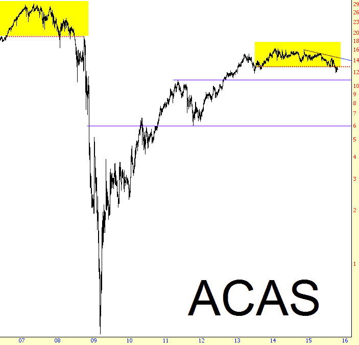
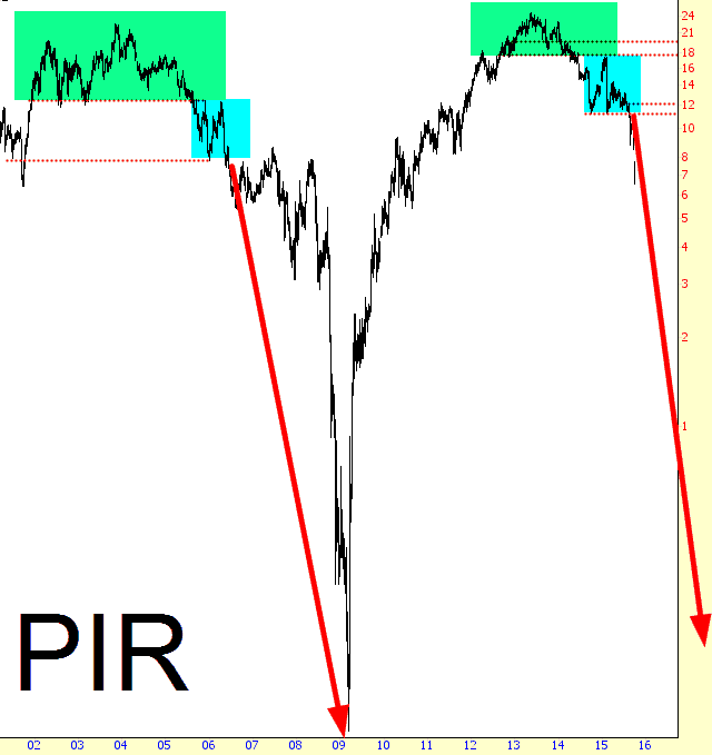
After I did my Whole Foods Bear Market post late last month, I started hunting around for other interesting parallels: that is, stocks which had topped out around 2006-2007 and then went into a complete, utter, and stunning free-fall. The additional requirement, of course, was that they be exhibiting a topping pattern as of right now. My thesis is that these are sample “canaries in the coal mine” which illustrate far better than the insanely-manipulated /ES market how unhealthy equities are.
First is Pier One, that purveyor of throw pillows, scented candles, and coconut monkey dolls:
September and Q3 are officially in the books.
Summer bears are likely mostly happy, Dennis Gartman’s outlook on the S&P 500 notwithstanding.
There’s been a lot of talk about is this more 2011, or 2007/2000?
Calling Doc Brown. Fire up your flux capicators to 1.21 gigawatts, as we take a trip back in time.
1. SPX analog vs. 2011 on the monthly chart

Want to see something really cool? It occurred to me that Whole Foods topped out well before the S&P did back about eight years ago. Likewise, Whole Foods (where my family drops thousands upon thousands of dollars every year) topped out well before the most recent bull market termination. Out of curiosity, I measured the distance, and they’re just about identical.
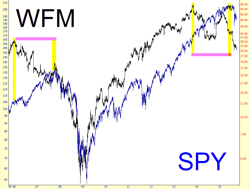
This is the kind of thing that approximately no one else on the planet would think about, because, sorry soul that I am, after looking at millions of charts, one starts having insights that don’t require research. They simply occur to me. So: voi-freakin’-la.
