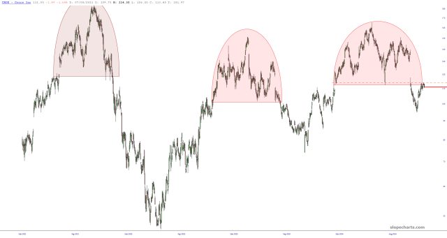
My CROX shorts (err, the put position, not the garment) look better than ever.
Slope initially began as a blog, so this is where most of the website’s content resides. Here we have tens of thousands of posts dating back over a decade. These are listed in reverse chronological order. Click on any category icon below to see posts tagged with that particular subject, or click on a word in the category cloud on the right side of the screen for more specific choices.
My CROX shorts (err, the put position, not the garment) look better than ever.
For those not acquainted with my TSLA bona fides, I have been writing in the most glowing terms about Elon Musk and his creations for over a decade. Here is just one example from almost a dozen years ago (a post so old, the graphics don’t even exist on the server anymore!) in which I wrote:
Within days, I’m picking up a Model S (long-since reserved; there’s a one-year wait). I have a deep fondness for Tesla; their founder, Elon Musk, is an incredible entrepreneur; the attention to detail to the product line is Steve Jobsian, and the chart looks poised to break out. I’m going old school and buying a bunch of stock for my kids, getting it in certificate form, and shoving it into a safe deposit box. I think this company has a very bright future ahead.
I’d say I nailed that prediction, wouldn’t you?
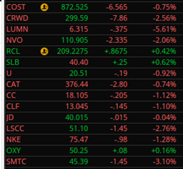
(more…)We’re just over an hour into the trading day, and it’s look good so far. Below are my fifteen bearish positions (I am long puts on all of these, expiring no sooner than January 17 2025). Three are up a tiny bit, but on the whole it’s a really good morning.
Using liquidity data from the Federal Reserve was all the rage a couple of years ago on Slope, but I don’t mention it as often as I used to. I’d like to make an exception today, because I was quite taken by the chart created with this easy-to remember symbol:
(((FR:WALCL-((FR:WTREGEN1000)+(FR:RRPONTSYD1000)))/1000)/1.1)-1625+(FR:H41RESPPALDKNWW/250)
The juicy stuff – – and, yeah, it’s pretty juicy – – is below just for paying subscribers, so here goes:
(more…)
