I decided to take a leisurely stroll through our economic charts, which you can find described here. Below are eight intriguing charts with relatively recent data, and a description of each is in the watermark.

Slope initially began as a blog, so this is where most of the website’s content resides. Here we have tens of thousands of posts dating back over a decade. These are listed in reverse chronological order. Click on any category icon below to see posts tagged with that particular subject, or click on a word in the category cloud on the right side of the screen for more specific choices.
I use Grok (for obvious reasons) almost exclusively for AI stuff. I’m pleased to see that the company has grown so much in value, from $1 billion early last year to about $113 billion (!!!!) today.

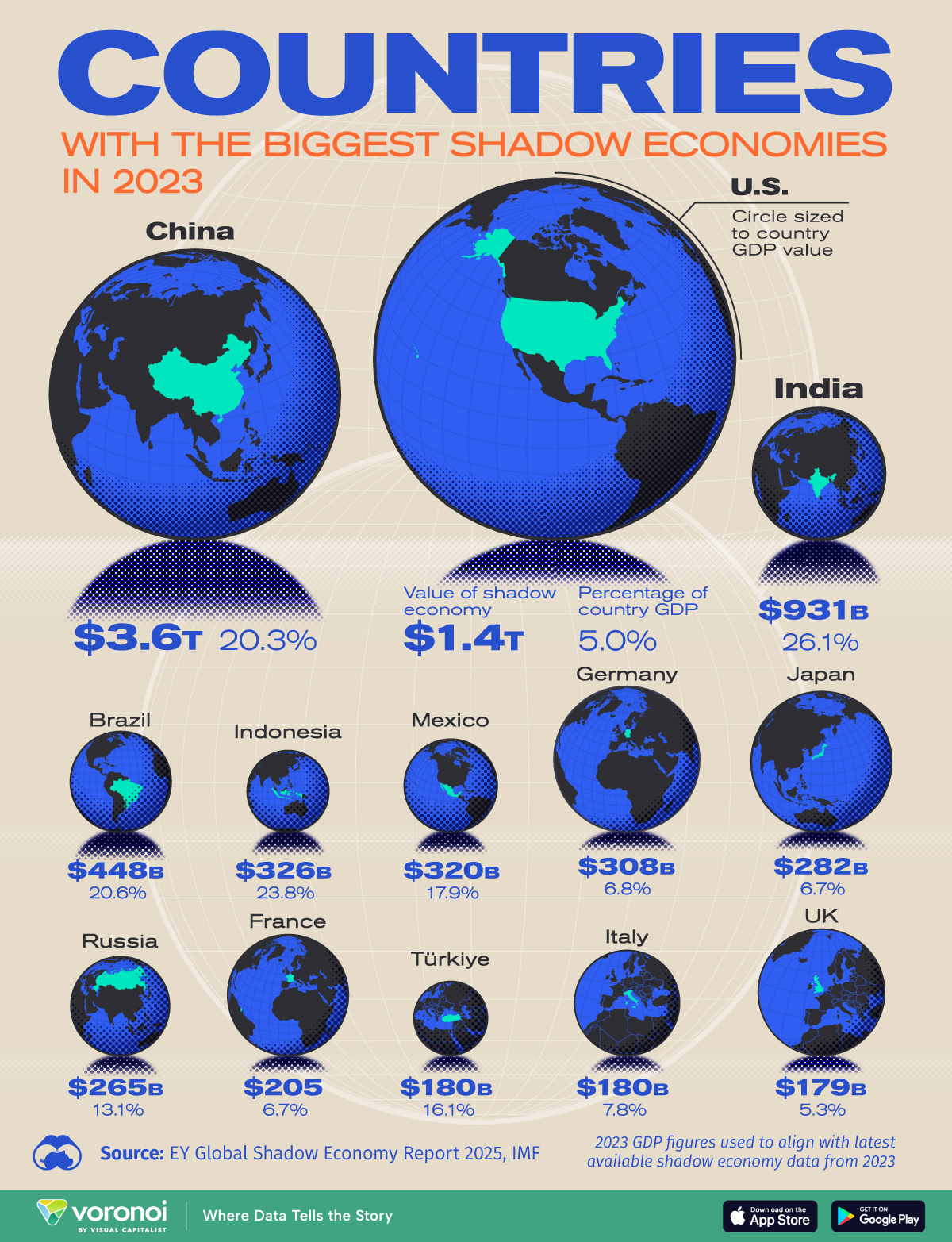
Here’s an illustration of how large the “shadow” economy (drugs, criminal activity, black market, etc.) is in various countries as well as the percentage of the economy overall. For instance, the shadow economy in the U.S. is fairly small (5%) but is the largest in absolute terms, whereas over one-fifth (!) of China’s economy is “shadow”, I suppose because it is such an oppressive and tyrannical state.
Here’s an updated diagram of the most valuable public companies. As a reminder, you can get the historical market cap for any stock on this special page, and you can get a sorted list of the biggest market cap firms on this ranking page.

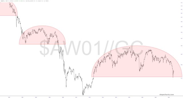
Below are a few ratio charts of note.
The first, which you’ve seen many times, is still playing out beautifully. The long-term theme is simple: bullish precious metals/bearish equities. This topping pattern is gargantuan and powerful.