Below are a few ratio charts of note.
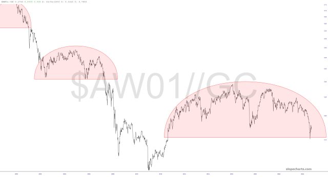
The first, which you’ve seen many times, is still playing out beautifully. The long-term theme is simple: bullish precious metals/bearish equities. This topping pattern is gargantuan and powerful.
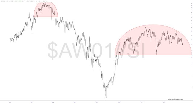
There’s a similar setup for silver, although with silver’s progress badly stymied lately, the breakdown isn’t as close to complete.
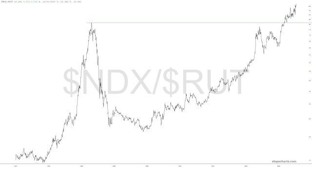
In the least-surprising news of the day, the NASDAQ stocks have utterly overpowered the small caps, and continuing to push to never-before-seen levels
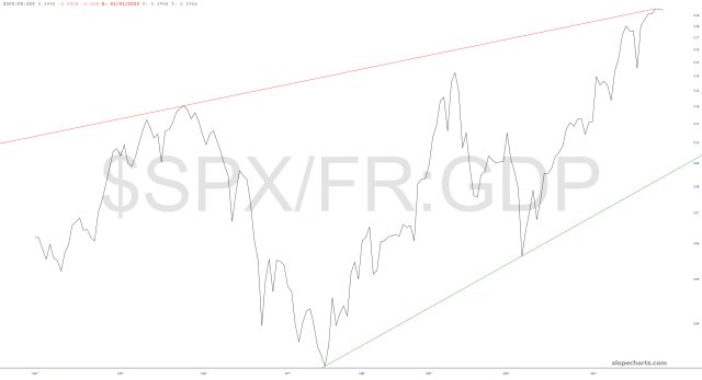
The multi-decade chart of the S&P 500 divided by the GDP shows that early this year we tagged the lifetime resistance trendline and that, relative to the economy, stocks have never been more highly-valued.
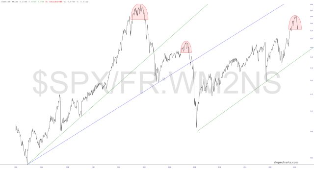
The ratio chart of the S&P 500 index compared to the M2 money supply likewise illustrates a perfect topping pattern having just completed.
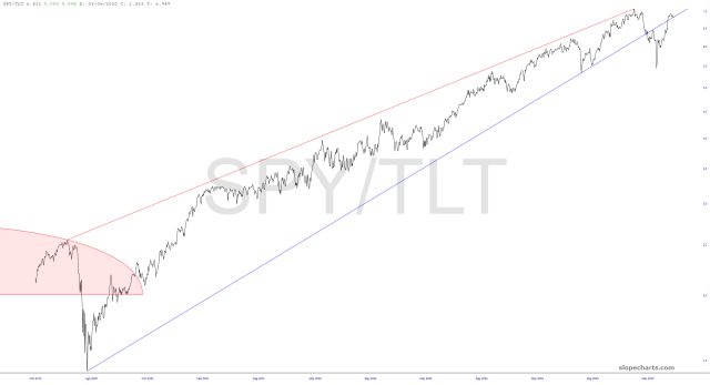
Most alluring of all, the wedge of the S&P ETF divided by the bond ETF plainly shows a crucial failure and a pitch-perfect retrace. A descent from this busted trendline seems to be the natural next step.