Slope of Hope Blog Posts
Slope initially began as a blog, so this is where most of the website’s content resides. Here we have tens of thousands of posts dating back over a decade. These are listed in reverse chronological order. Click on any category icon below to see posts tagged with that particular subject, or click on a word in the category cloud on the right side of the screen for more specific choices.
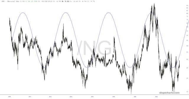
Gas Cycle Burning
Although I sold my BOIL a while back, I still look at it, and natural gas, at least once a day. That extremely long-term cycle pattern is still holding sway, and I point it out only because it’s the only powerful cycle I think I’ve ever seen on any chart.
Rhyming Bearish Triangles on Oil & Gas
There’s an old saying from Mark Twain that history doesn’t repeat itself, but it often rhymes, meaning that the same patterns recur, but are never quite the same.
Back on Sunday 11th August I recorded a The Bigger Picture video in which I was looking at two possible bearish triangles on oil and gas. These weren’t at the same stage, but I have been thinking that they might well be part of the same possible overall sequence.
A couple of weeks later the triangle on oil (shown here on $WTIC), broke down with a minimum target at a retest of the 2023 low at 63.57. This is the chart I posted with The Bigger Picture video I recorded on 25th August.
(more…)Skimming Stones
The day begins with the futures just a little red, owing to the fact that they weren’t given another nightly gift of $500 billion yuan to make things seem prosperous and thriving. Thus, the /ES is skimming just under the surface of lifetime highs set on Thursday (Although I will note that, over the course of 2024, a full 42 record highs have been set in the equity markets, so I guess they’re just taking a breather).
Bring On the Nukes!
It’s a true shame that the protests and long-hairs of the 1970s did such damage to America’s nuclear energy. It’s a marvelous source of power, and I hope it eventually gets popular again.
