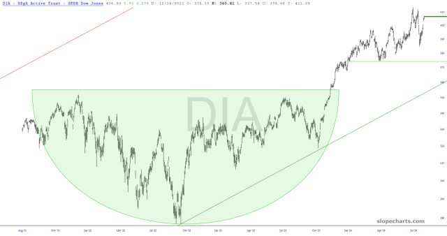
Preface to both posts: on Friday evening, I went through my list of key ETFs, and I found eight that seemed strong and eight that seemed vulnerable to weakness. Here are the strong-looking ones, in alphabetical order of their symbols:
Slope initially began as a blog, so this is where most of the website’s content resides. Here we have tens of thousands of posts dating back over a decade. These are listed in reverse chronological order. Click on any category icon below to see posts tagged with that particular subject, or click on a word in the category cloud on the right side of the screen for more specific choices.
Preface to both posts: on Friday evening, I went through my list of key ETFs, and I found eight that seemed strong and eight that seemed vulnerable to weakness. Here are the strong-looking ones, in alphabetical order of their symbols:
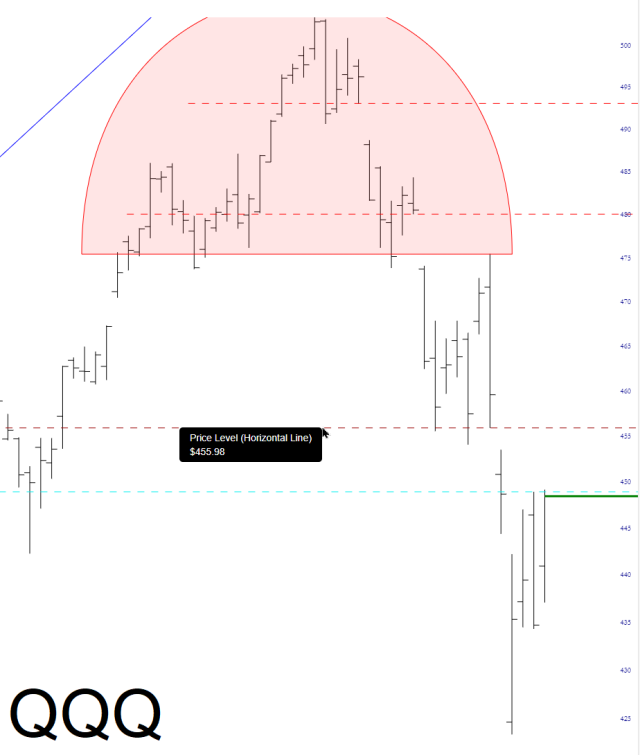
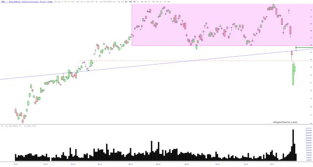
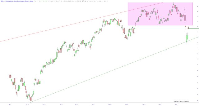
Below are ten ETF charts with crucial gap levels (that is to say, resistance levels) highlighted. The first three are visible to everyone, and the other seven are visible to all paying members.