Housing is local…UNTIL IT IS NOT

Slope initially began as a blog, so this is where most of the website’s content resides. Here we have tens of thousands of posts dating back over a decade. These are listed in reverse chronological order. Click on any category icon below to see posts tagged with that particular subject, or click on a word in the category cloud on the right side of the screen for more specific choices.
Assuming that, out of the blue, every single one of these doesn’t decide to break tradition! The green tints represent the PEAK of each sine wave, and the red circles represent the PEAK of each price pulse.

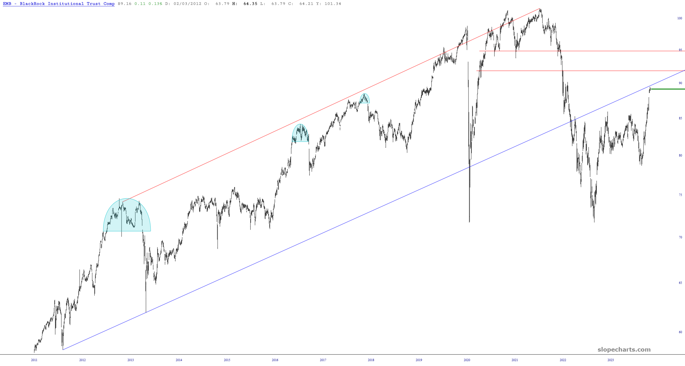
Below is the chart EMB, which is the fund of emerging market bonds. .As with all assets over the past ten weeks, it has been a straight shot up. Allow me to quietly point out the proximity of the present price level to its broken long-term trendline. I’m thinking that’s about all she wrote on this rally.