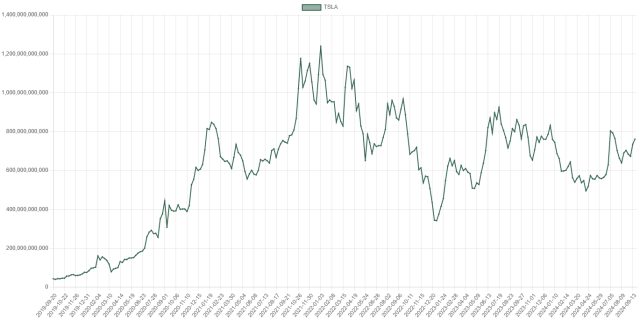
Just to make plain the difference between our new Market Cap charts (top) and the regular Historical Price charts. The example provided here is Tesla, which briefly enjoyed the status symbol of being in the Trillion Dollar Valuation club.
Slope initially began as a blog, so this is where most of the website’s content resides. Here we have tens of thousands of posts dating back over a decade. These are listed in reverse chronological order. Click on any category icon below to see posts tagged with that particular subject, or click on a word in the category cloud on the right side of the screen for more specific choices.
Just to make plain the difference between our new Market Cap charts (top) and the regular Historical Price charts. The example provided here is Tesla, which briefly enjoyed the status symbol of being in the Trillion Dollar Valuation club.
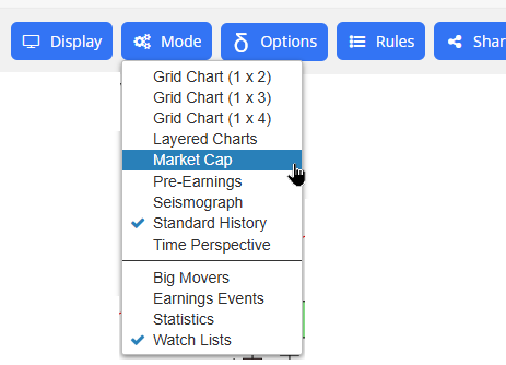
I am very pleased to let you know of an exciting new feature on Slope – – something I haven’t seen ANYWHERE else on the web – – which is accessible immediately for all paying members. Today we introduce Market Cap Charts, which are accessible directly on this page or by way of this menu in SlopeCharts.
In recent weeks, I’ve been spending a lot of time and money on our data back end. I’d like you to know of a meaningful improvement that is now live, which is higher quality intraday charts.
A week or so ago, I wrote to the Gold and Platinum folks about this, but it’s even better now. There are two huge improvements:
I’d also like to mention that Slope cleans up the data which, I assure you, has been notoriously dirty for my entire multi-decare career. This is what 120 days of minute bar data looks like with SlopeCharts filtering:
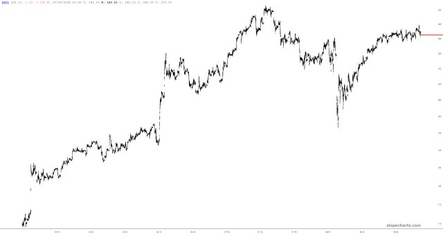
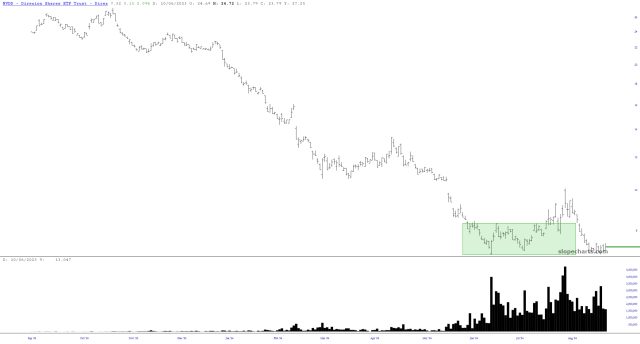
Well, here we are. NVDA is about to either blow up the entire AI Mania or throw it a lifeline. One thing’s for sure – – it has become a market unto itself, with derivative instruments like NVDD gathering up huge amounts of trading volume in recent months.