
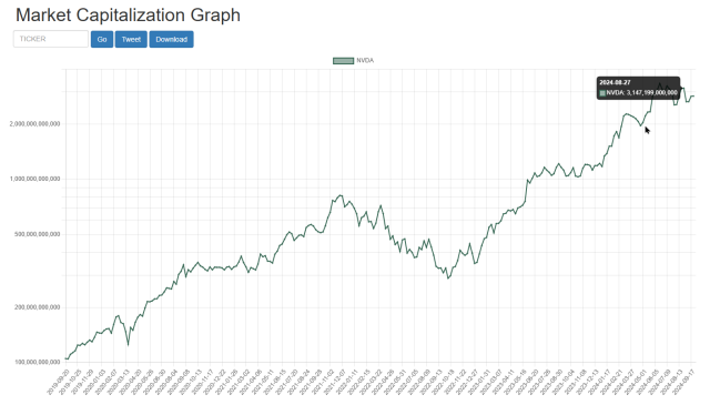
I am very pleased to let you know of an exciting new feature on Slope – – something I haven’t seen ANYWHERE else on the web – – which is accessible immediately for all paying members. Today we introduce Market Cap Charts, which are accessible directly on this page or by way of this menu in SlopeCharts.
As you probably have surmised from the name, these charts present to you the historical market capitalization (that is, the total value) of any given public entity. Aren’t these the same as regular price charts? Not at all. Sure, the path will be similar, but the information being presented is completely different, since instead of showing you the per-share price of a stock, it shows you the aggregate value of the entire organization.
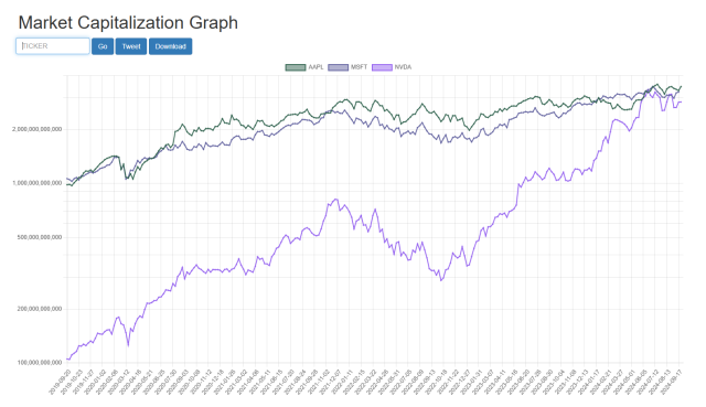
You can just punch in symbol after symbol, or you can plot multiple companies on the same chart to compare how their own market cap journeys have progressed over the years.
We hope you enjoy this new and, as I said earlier, totally unique feature on Slope!
