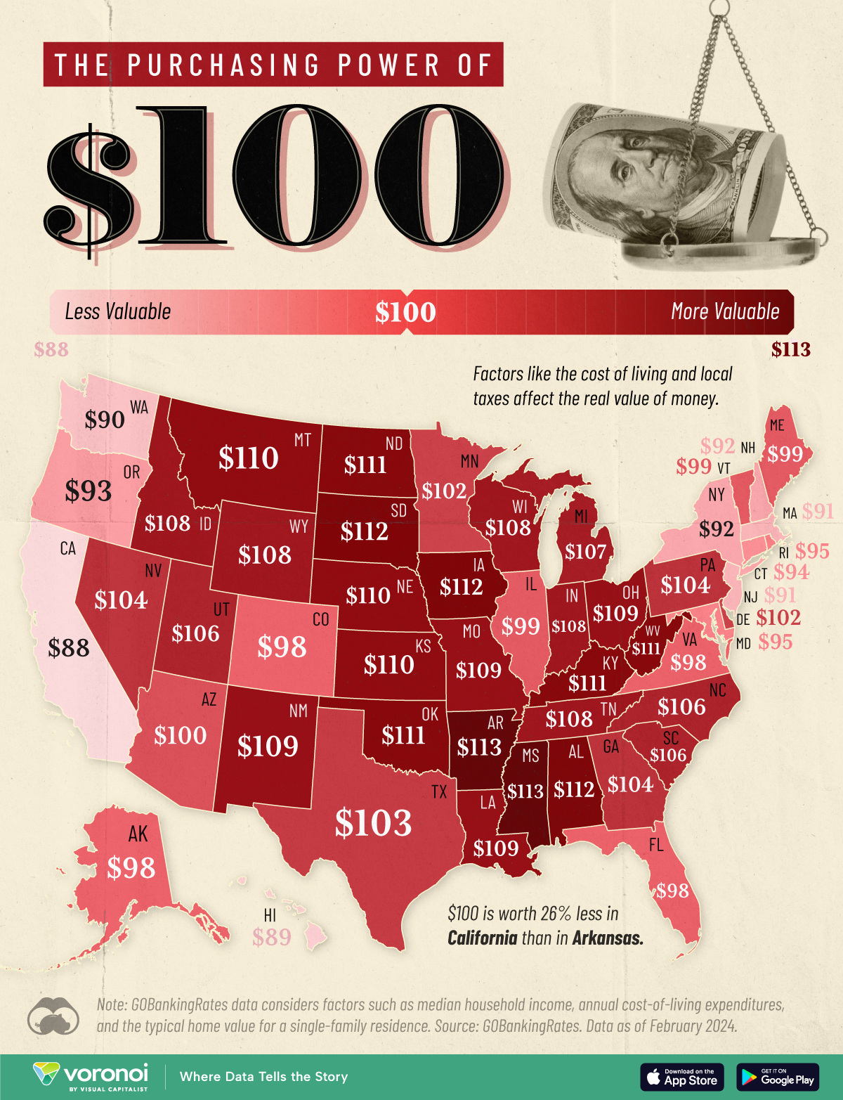
Looks like the Midwest excels at basic academic achievement. Southwest Texas? Not so much.

Slope initially began as a blog, so this is where most of the website’s content resides. Here we have tens of thousands of posts dating back over a decade. These are listed in reverse chronological order. Click on any category icon below to see posts tagged with that particular subject, or click on a word in the category cloud on the right side of the screen for more specific choices.
Looks like the Midwest excels at basic academic achievement. Southwest Texas? Not so much.
We approach the day of peril on Wednesday! I have 33% of my account in cash reserves, and I won’t deploy it until Thursday morning, once the FOMC insanity is done. In the meanwhile, here are my eight bearish positions in my secondary account:
We approach the day of peril on Wednesday! I have 33% of my account in cash reserves, and I won’t deploy it until Thursday morning, once the FOMC insanity is done. In the meanwhile, here are my eight bearish positions in my main account:
At long last, Mississippi comes out on top.
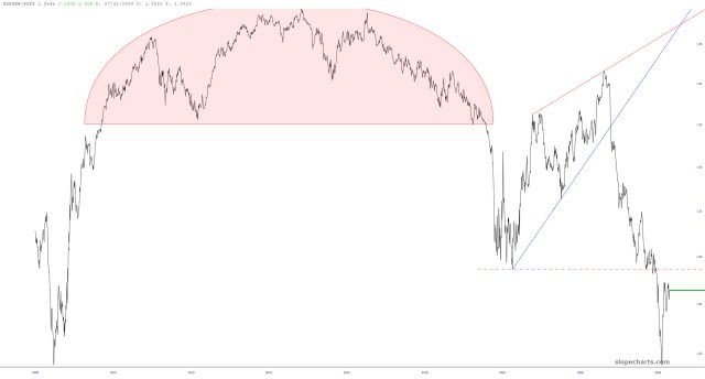
The symbol $SPXEW/$SPX is a ratio chart which divides the equal-weighted S&P 500 by the “normal” oh-so-heavily weighted S&P 500. It illustrates market breadth. In a perfect world, it would be a flat line, showing that all 500 stocks were moving up and down perfectly together. Instead, the ratio chart shows a severely degrading situation, emphasizing the eroding breadth of the market.