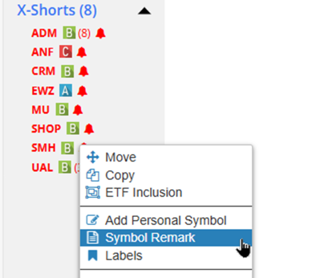
As everyone in the solar system knows, NVDA reports twenty minutes after the close today. Below is just a sampling of the kind of cool stuff here on the Slope of Hope which is germane to any company during earnings season. Many of these features are exclusively for our beloved paid members.
(more…)Slope of Hope Blog Posts
Slope initially began as a blog, so this is where most of the website’s content resides. Here we have tens of thousands of posts dating back over a decade. These are listed in reverse chronological order. Click on any category icon below to see posts tagged with that particular subject, or click on a word in the category cloud on the right side of the screen for more specific choices.
Introducing Historical Earnings
Although technical analysis is the basis of the Slope of Hope, there is still something to be said for actual profits and losses when it comes to corporate performance. We have decades of information regarding corporate earnings dates, projected quarterly results, and actual quarterly resorts, all presented in a clear, easy-to-use chart.
The historical earnings performance page is located here, and all you need to do is enter the ticker symbol of interest and click Go. The chart will show you all of the information in our database, plotted as expected earnings (in blue) and actual earnings (in black).
(more…)Slope is So Beautiful!
If you’re on a real computer (AKA not a phone), click on the image below and just take a moment to drink it is. Just to toot Slope’s horn for a bit, I honestly look at a screen like this and can hardly believe this is something I’ve created. It took me a long time – – I’ve been at this since 2005, after all – – but here it is. I absolutely love this site. I truly do.
It represents a substantial part of my adult life, and in particular I’d like to thank all our premium subscribers for funding its development. We’ve created something one-of-a-kind here, folks! Thank you!
Experiment in the Lab
I was reading an article on another website today when I stumbled upon this comment.
(more…)Real Life Chart Lab
In case you didn’t see my announcement yesterday, we rolled out an important new feature in SlopeCharts yesterday called Chart Lab. The genesis of this feature was my desire to improve the Fed Spread which, now that Chart Lab is live, I was able to do. This isn’t to say I won’t be messing around with it more, but so far, I like the results.
(more…)