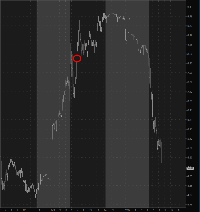
Wow, what a day!
Allow me to start by sharing with you a tweet I sent out about thirty hours ago:

Slope initially began as a blog, so this is where most of the website’s content resides. Here we have tens of thousands of posts dating back over a decade. These are listed in reverse chronological order. Click on any category icon below to see posts tagged with that particular subject, or click on a word in the category cloud on the right side of the screen for more specific choices.
Wow, what a day!
Allow me to start by sharing with you a tweet I sent out about thirty hours ago:
If you want to see how meandering, directionless, and trendless this calendar year has been thus far, I present to you the percentage charts YTD of a variety of major indexes. Pretty sad stuff, folks!
I’ve seen in mentioned that Q1 2022 was the same as Q1 2020 – – that is, a hard, fast selloff followed by a V-shaped recovery. Well, yes, I can certainly see the similarities. But I do want to point out one key difference by way of layered charts:
I think my Virtual Trading Equity Curve pretty much tells the story: I peaked on March 14th and am down 70% since then (or about $400 billion). Hey, easy come, easy go. At least it’s fake! Let’s just say my real portfolio isn’t quite as aggressive.