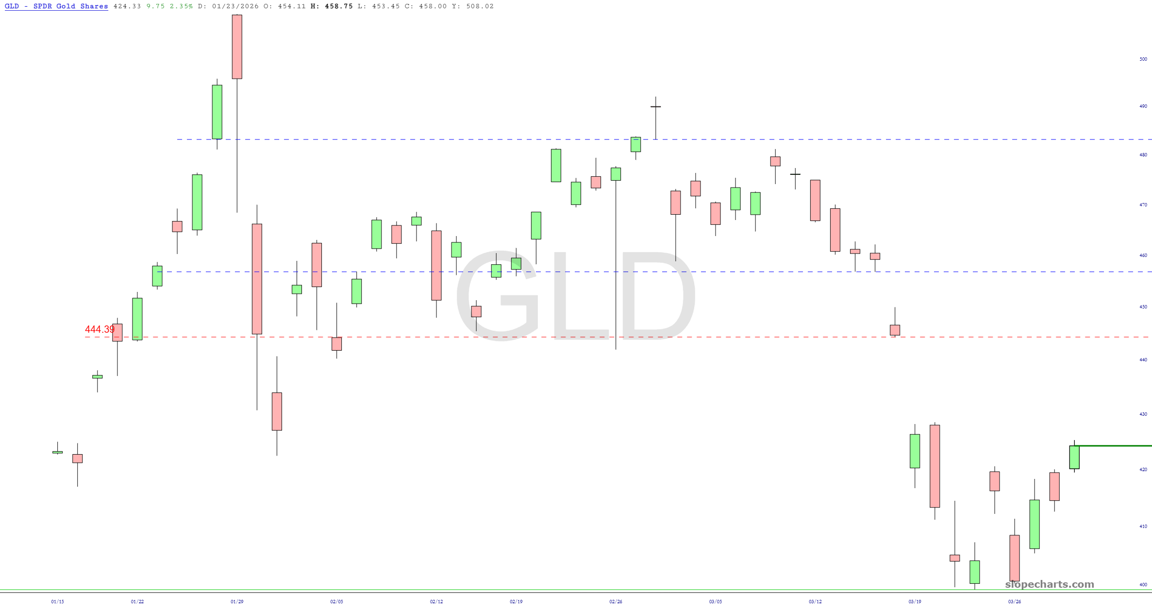
Slope of Hope Blog Posts

Slope initially began as a blog, so this is where most of the website’s content resides. Here we have tens of thousands of posts dating back over a decade. These are listed in reverse chronological order. Click on any category icon below to see posts tagged with that particular subject, or click on a word in the category cloud on the right side of the screen for more specific choices.

Fed Spread 2.0

By -

About six weeks ago, I did a post called The Near-Perfect Predictor which illustrated how, with some formulaic sleight-of-hand with SlopeCharts, its layered charts feature, and its access to Federal Reserve Economic Data, it could offer up a remarkably prescient view into what the S&P 500 was going to do next.

Ever since then, every Thursday, I have published for premium members up-to-date charts illustrating what the chart portends. (Interestingly, when I did the post, the S&P was just about at its juiciest with respect to potential to fall). Here were my crazy scribblings at the time:

(more…)

Linear or Log (by LZ)

By -

You wrote a book on the subject of financial panics, so here’s a question: should bears use linear charts for help with predicting eventual bear market lows? Not necessarily for a price target, but more to understand the scale of what’s coming.

I thought of this when looking at Home Depot after your post, because it looks like a perma-riser chart about to break support (huge event by itself) , but when I changed the view to linear, it looks like an obvious bubble since maybe 2009 with a possible stretch target of $22. The $50 area looked like the biggest support area after Covid lows until I saw the linear chart. 

(more…)

Layered Chart Improvements

By -

Yes, even on a Sunday during a 3-day weekend, the Slope of Hope keeps evolving and getting better.

One of my favorite features that we’ve added is Layered Charts, and there are two important new improvements I wanted to describe. The first one is a new button called Spread:

What this does is color in the area between the two lines which constitute a layered chart. I think you can see instantly why this would be useful, because you can quite plainly tell how big the spread is, which “direction” the spread presently is going, and whether it’s converging or diverging.

(more…)

Volume Profile Improved!

By -

I am very pleased to tell you that, even in the midst of an insane traveling schedule, we are rolling out a much-improved Volume Profile study. Specifically, we have expanded the depth of data to include much more comprehensive history. You will now see a new dropdown in the parameters for this study which lets you choose how much volume data you want analyzed: from as little as the most recent trading day all the way to “All”, which constitutes about twenty months of intraday data (which is a lot of information).

(more…)