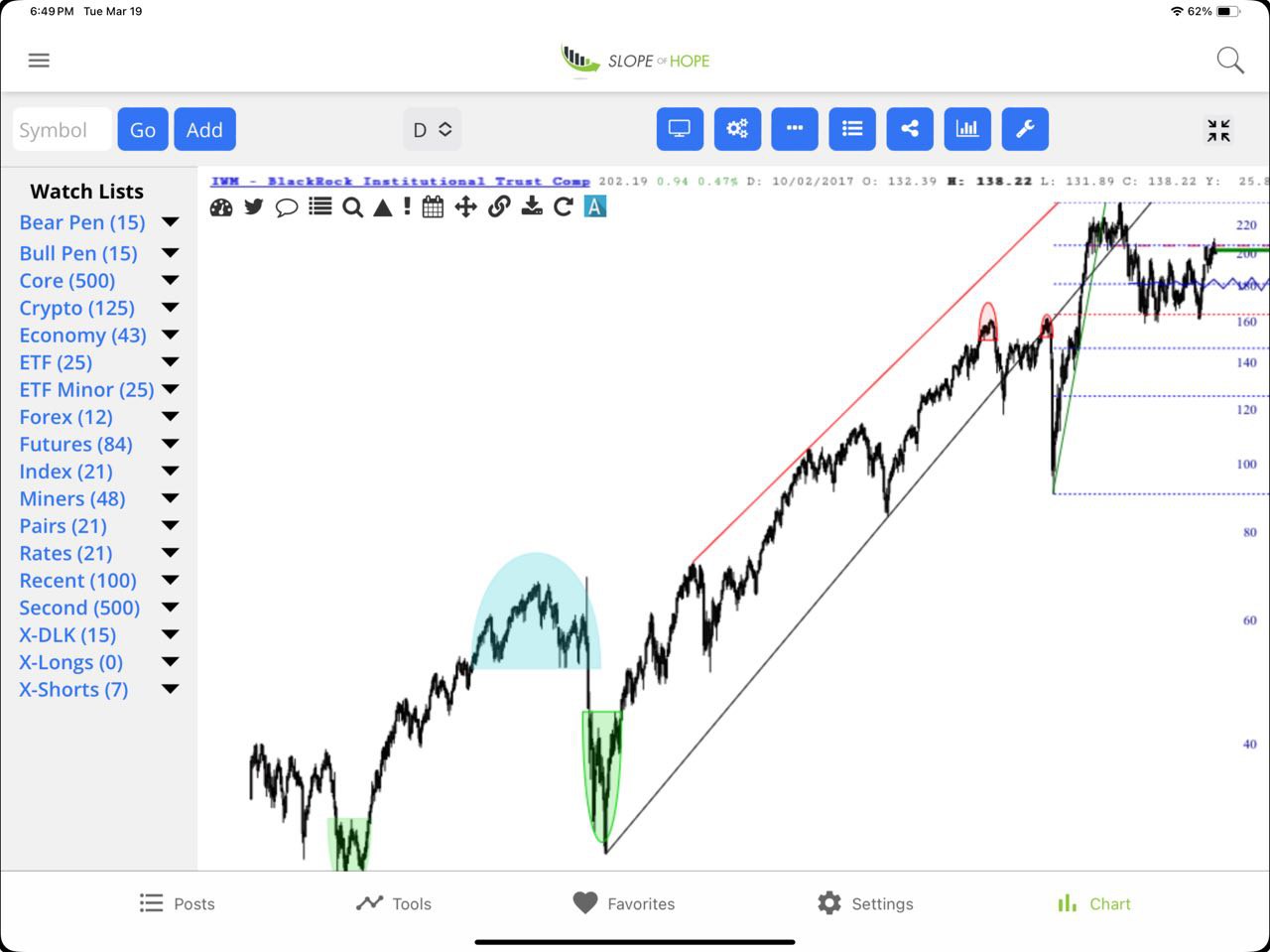
As a person who prefers eight very large monitors on his desk for maximum screen real estate, I’ve always puzzled why anyone would want to watch the world of financial markets on a screen the size of a business card. In spite of my misgivings, a huge portion of Slope users actually get to the site via our mobile app, and I wanted to mention that we’ve done an important tweak which would make upgrading it worthwhile. Specifically, the charts look better. Here, for instance, is a snapshot I just took off my iPad.