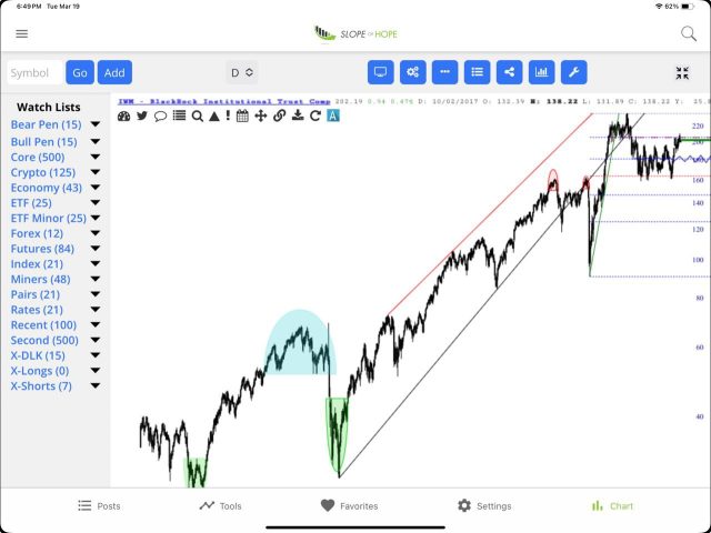
As a person who prefers eight very large monitors on his desk for maximum screen real estate, I’ve always puzzled why anyone would want to watch the world of financial markets on a screen the size of a business card. In spite of my misgivings, a huge portion of Slope users actually get to the site via our mobile app, and I wanted to mention that we’ve done an important tweak which would make upgrading it worthwhile. Specifically, the charts look better. Here, for instance, is a snapshot I just took off my iPad.

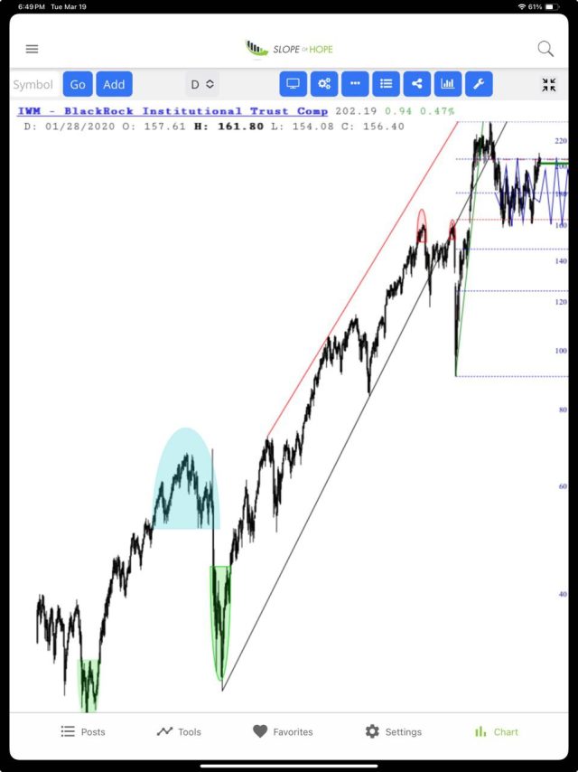
More importantly, here’s the same chart in portrait mode. We’re now hiding the watch lists and tools in order to give the chart plenty of room, because beforehand it looked like ka-ka. (As you can see from the prior chart, if you want access to the watch lists and tools, just tilt your device to landscape mode).

The mobile app is free, and as much as I’d like to just magically update everyone’s version, I’m afraid that you’ll need to delete and then download the software again, which should just take a few moments. If you’d like to do this, these are the links:

