I have two very quick questions to ask all Slopers; please take a moment to answer:
Slope of Hope Blog Posts
Slope initially began as a blog, so this is where most of the website’s content resides. Here we have tens of thousands of posts dating back over a decade. These are listed in reverse chronological order. Click on any category icon below to see posts tagged with that particular subject, or click on a word in the category cloud on the right side of the screen for more specific choices.
Do Your Worst!
OK, folks, let’s try this again.
By way of background, the Slope of Hope has had a long-time issue in which, on occasions, comments would get eaten. For some folks, this never happened. For others (I’m looking at you, IndyZ) it was a constant.
We have probably poured more time and money into fighting this bug than any feature on the entire site. So, with a nervous twitch, I will ask you all to jump up and down on comments, either via classic comments or in SlopeTalk. Please let me know if it’s better or not. Here’s hoping it’s the former!
Please note to hit Ctrl-F5 in your browser when you go to whatever page you decide to use, just to make sure you have the latest version.
PREMIUM: A Revealing Insight
Note: This post is special enough to be labeled a premium post, which means that it is (with the exception of the paragraph you are reading now) visible only to paying subscribers (AKA the people who keep Slope going day after day). If you would like to try a risk-free subscription to get immediate access to all premium content, as well as the dozens of other features exclusive for paid accounts, click here to explore the choices. Everyone is welcome to continue chatting in comments below (or, for a more free-flowing experience, please use SlopeTalk).
Click here for a special 99 cents offer to try Gold out super-cheap! In your heart, you know he’s right.
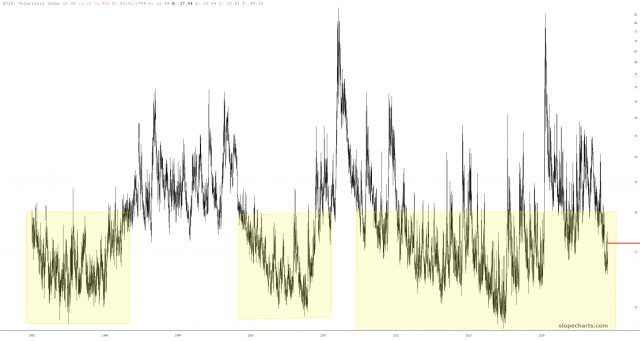
A Different Slice of Volatility
One of the countless features on Slope which doesn’t get the attention it deserves is the Time Perspective chart. Let’s use volatility as an example. Here is a historical chart of the VIX. Pretty boring, right?
Powerful Pairs
There are two premium features I used in SlopeCharts to create this post: Custom Symbols and access to the Economic Database. I created a variety of ratio charts, nine of which I found interesting enough to share here. I’m going to show everyone one of them, but the other eight are for paying members only (Bronze, Silver, Gold, or Platinum).
The first ratio chart I wanted to show was the All World index divided by the continuous contract of gold prices. Why on earth would I choose this goofy combination? Simple: because gold is real money, and by representing global equities with real money, it provides a vastly more realistic (indeed, the ONLY realistic) view into what global equities have actually done over the decades.
(more…)