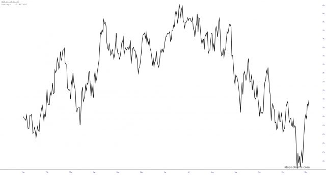
One of the countless features on Slope which doesn’t get the attention it deserves is the Time Perspective chart. Let’s use volatility as an example. Here is a historical chart of the VIX. Pretty boring, right?
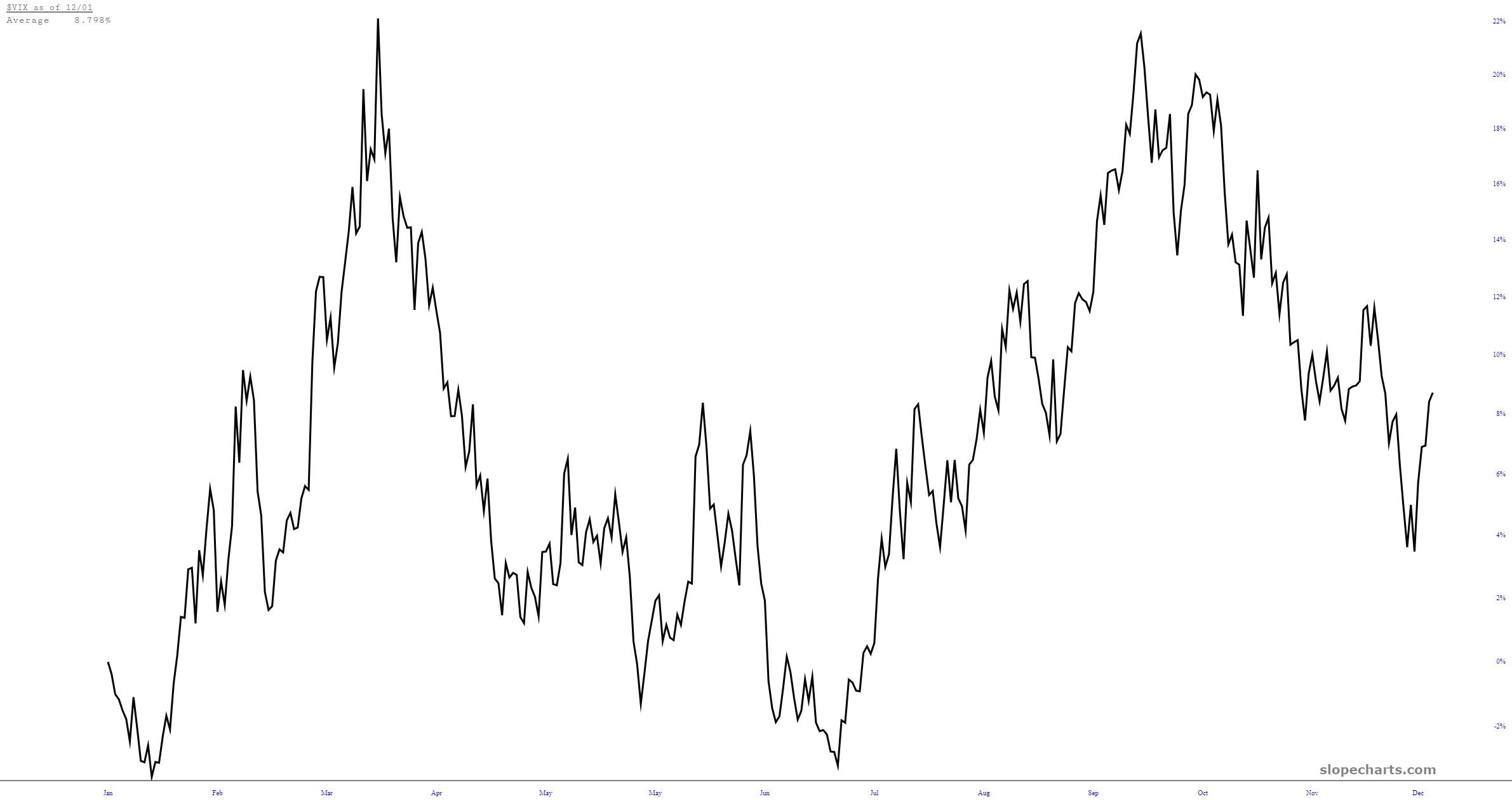
Change the mode to Time Perspective, and a very different picture emerges. Most specifically, the fact that, empirically speaking, we’re slated to have three months of a rip-roaring good time.
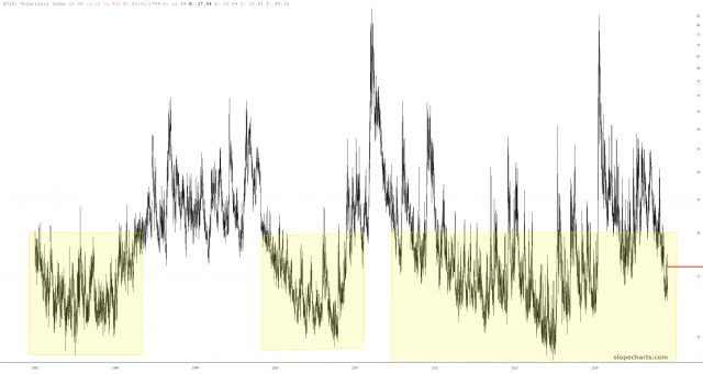
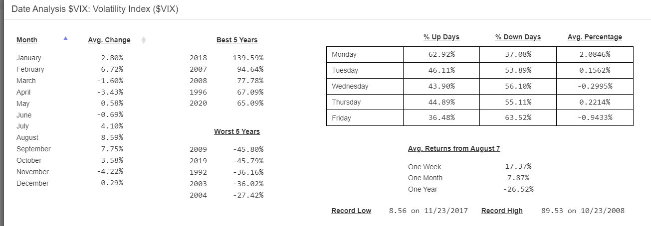
And, just to show off SlopeCharts a bit more, here is the Date Analysis.
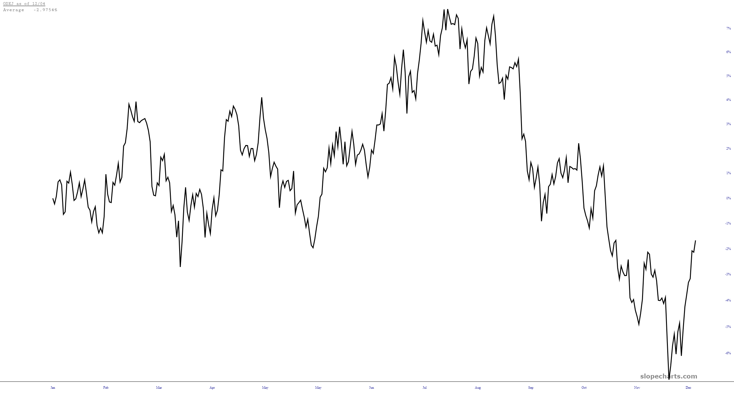
Super-extra-bonus chart: it’s clear that precious metals miners are entering a very weak seasonal period as well: