Neo NATO Care
Slope initially began as a blog, so this is where most of the website’s content resides. Here we have tens of thousands of posts dating back over a decade. These are listed in reverse chronological order. Click on any category icon below to see posts tagged with that particular subject, or click on a word in the category cloud on the right side of the screen for more specific choices.

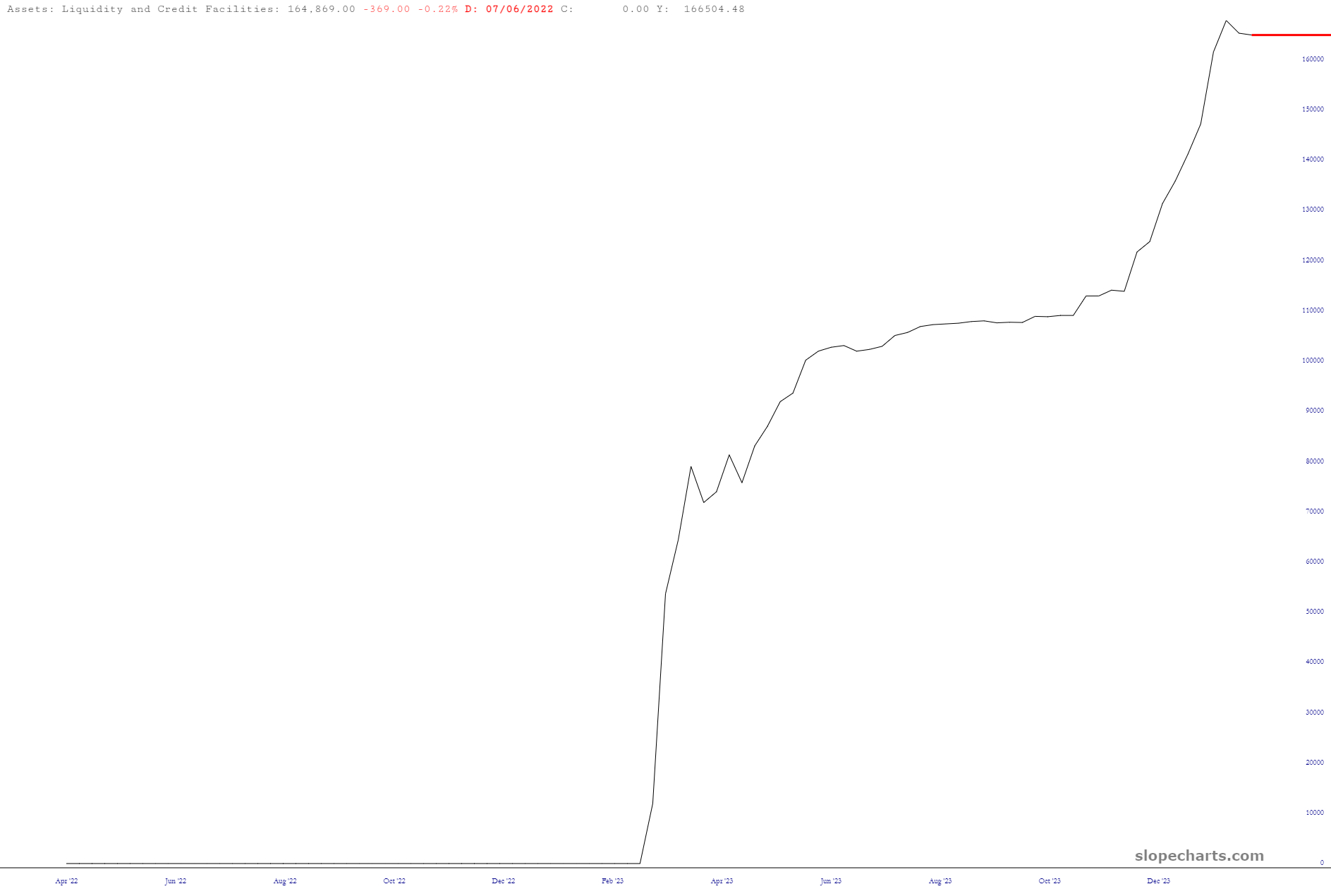
It’s end-of-day Thursday, which means the latest liquidity-oriented data from our friends at the FOMC has tumbled out. Let’s thumb through it. We’ve got Yellen’s BTFP program, which ostensibly is just a few weeks ago from being shuttered to any new lending:
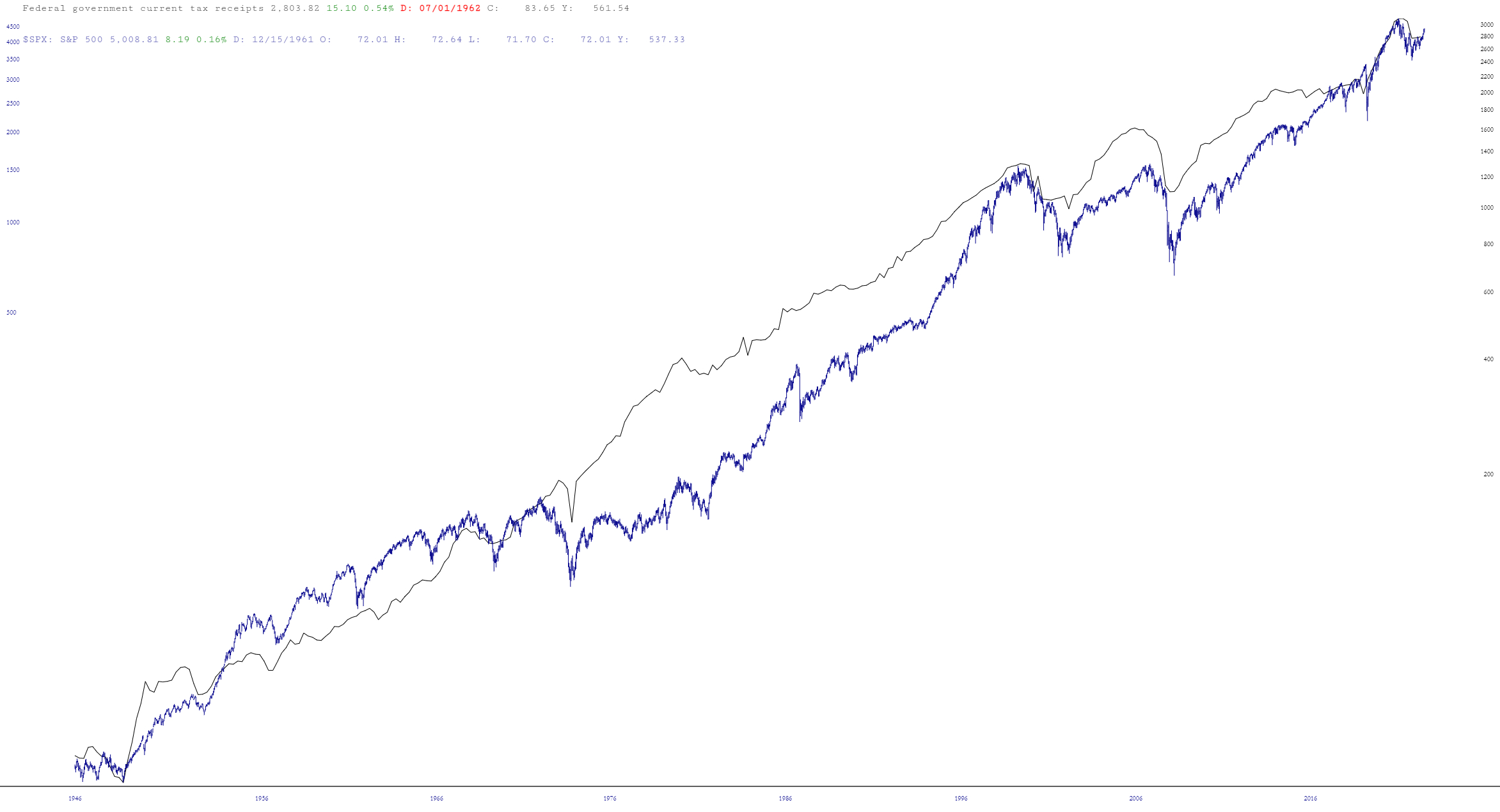
Insufferable data dork and chart nerd that I am, I was curious about the correlation between federal tax receipts and the stock market. Let’s just say they are pretty much joined at the hip:
I’d say the ol’ US is doing the lion’s share of funding, for sure.