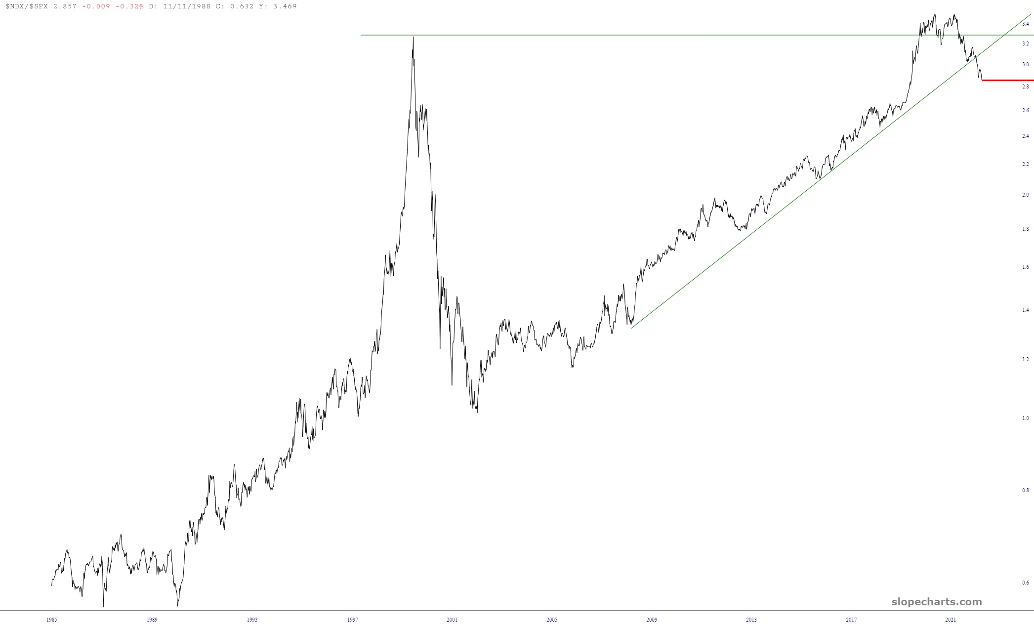
Here’s an interesting chart – it shows (black line) the cumulative advance/decline line along with the standard trio of exponential moving averages. Yet another piece of evidence that this market is laughably overbought.

Slope initially began as a blog, so this is where most of the website’s content resides. Here we have tens of thousands of posts dating back over a decade. These are listed in reverse chronological order. Click on any category icon below to see posts tagged with that particular subject, or click on a word in the category cloud on the right side of the screen for more specific choices.
A moment of silence, please, for the VIX, which has, for the first time since mid-August, sunk down into the teens. Now if you’ll excuse me, I’m going to go pray to any available god that Friday morning’s jobs report doesn’t offer a final death-blow to the bears, because frankly at this point, we REALLY need a down day, or else we might as well throw our arms up at the rest of the year.

Here I am on a Sunday night, testing out and tweaking a new feature. In doing so, I am resorting to my default behavior. You know how some people are said to have a Resting Bitch Face? Well, I’m kind of like that, except in my behavior. I have, umm, a Resting Chart Face, I suppose, because when I have nothing else to do, I’ll always drift back to charting. Thus, I give you this:

I’ll come right out and say it. I have gravely mishandled my trading in 2022, in spite of some awesome charting, and the solution to that fumbling is as simple as can be. It all comes down to this chart:
