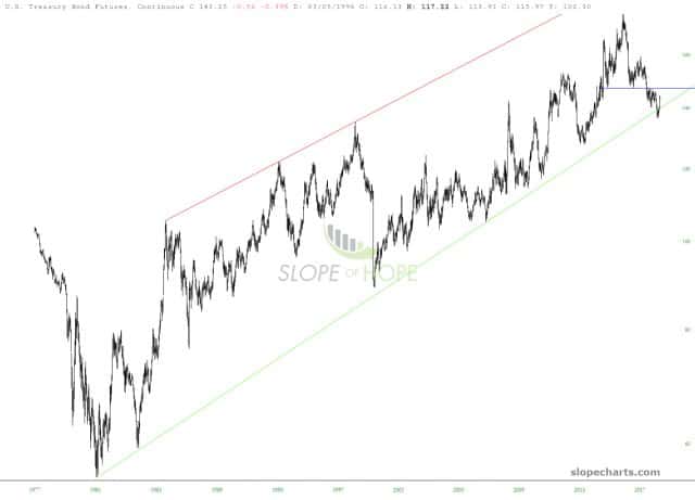
Well, it’s green on the ES and NQ for yet another day, but at least it’s not by much. Let us instead turn our attention to bonds, which I continue to contend are in trouble. Here’s the long-term continuous chart, featuring the channel failure:
Slope initially began as a blog, so this is where most of the website’s content resides. Here we have tens of thousands of posts dating back over a decade. These are listed in reverse chronological order. Click on any category icon below to see posts tagged with that particular subject, or click on a word in the category cloud on the right side of the screen for more specific choices.
Well, it’s green on the ES and NQ for yet another day, but at least it’s not by much. Let us instead turn our attention to bonds, which I continue to contend are in trouble. Here’s the long-term continuous chart, featuring the channel failure:
“The Harbinger of Doom”? Of course we (well, the media) are talking about the yield curve AKA Amigo #3 of our 3 happy-go-lucky riders of the macro. I have annoyed you repeatedly with this imagery in order to show that three important macro factors needed to finish riding before situation turns decidedly negative.
Amigo 1: SPX (or stocks in general)/Gold Ratio
Amigo 2: 30 Year Treasury Yield
Amigo 3: Yield Curve
In honor of Amigo 3’s arrival to prime time let’s have a good old fashioned Amigos update (going in reverse order) and see if we can annoy a few more people along the way. 🙂 (more…)
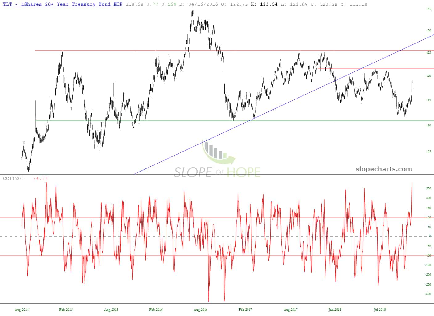
Hey, let’s face it, no one can screw up an election quite like the state of Florida, right? I guess that’s what’s driving the markets so much higher today. Anyway, I’m keeping a close eye on the bonds, which I believe will soon be repelled by those plunging moving averages……
My bearish-on-bonds disposition has remain unaltered all year, .and recent activity is pushing us toward what could be an important next step.


