This post is about this one illustration created by the boys down in Gainesville.

Slope initially began as a blog, so this is where most of the website’s content resides. Here we have tens of thousands of posts dating back over a decade. These are listed in reverse chronological order. Click on any category icon below to see posts tagged with that particular subject, or click on a word in the category cloud on the right side of the screen for more specific choices.
Let’s look at seven key index charts before we head into CPI week.
We begin with the NASDAQ 100, which is approaching a VERY important channel midline. That dashed line goes back a full 15 years (!) and, if broken, signals more wind in the bearish sails.

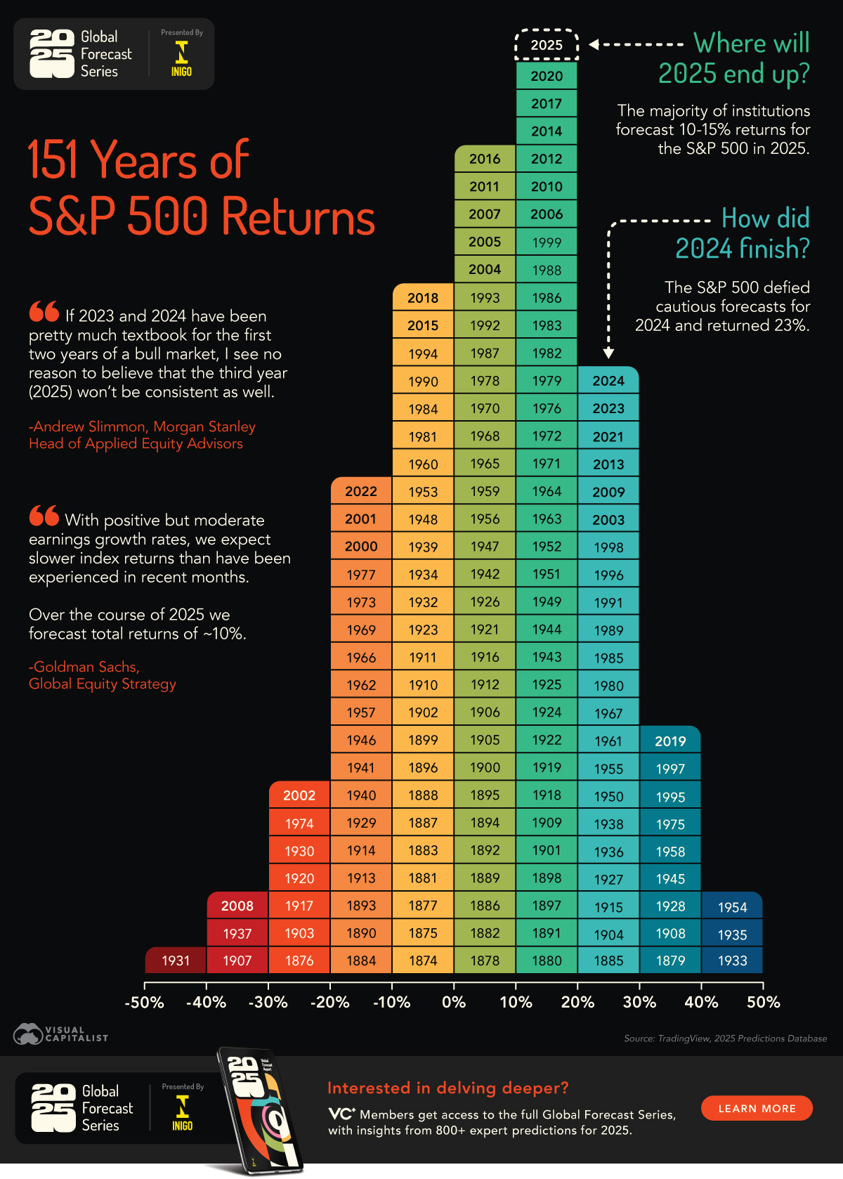
Here is a novel and succinct way to illustrate annual returns for the stock market of a period of many years. I guess I’m a 1931 kind of fella, which is the year my late father was born.
This is the rare time when we can look at annual bars in their pure form, with 2024 finally put to bed. It’s tough to draw many insights from hundreds of days collapsed into a single trading bar, but let’s look at five of them.
We begin with the NASDAQ Composite, which quite obviously had a grand time this year. We closed quite near lifetime highs. I’d like to point out we haven’t had two back-to-back red bars in over TWO DECADES, so, yeah, being a bear sucks. Stay tuned, though.