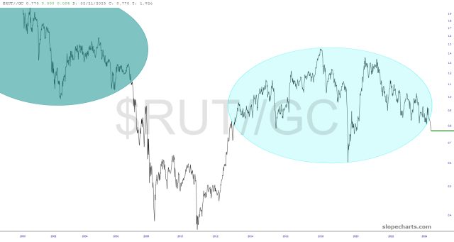
This ratio charts are so much more meaningful than their component parts. The story is simply: small caps are in trouble, and precious metals are going to shine.
Slope initially began as a blog, so this is where most of the website’s content resides. Here we have tens of thousands of posts dating back over a decade. These are listed in reverse chronological order. Click on any category icon below to see posts tagged with that particular subject, or click on a word in the category cloud on the right side of the screen for more specific choices.
This ratio charts are so much more meaningful than their component parts. The story is simply: small caps are in trouble, and precious metals are going to shine.
In December I was leaning towards seeing a retracement / consolidation on Crypto in the first half of this year and then strong new highs towards the end of the year with possible bull market highs pencilled in for Nov/Dec 2025.
That retracement / consolidation is now in progress and I’ll be looking today at the key support levels I’ll be watching on what I expect to be a bullish consolidation.
Is it possible that the Crypto bull market has already ended? Yes, but I’m leaning against that. I’ll be explaining why that is in my next post.
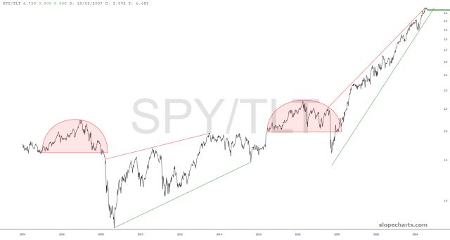
(more…)Stocks and bonds have an important, but ever-changing, relationship. It isn’t as simple as being inversely correlated. Far from it. Looking at the SPY/TLT ratio provides, I believe, an interesting pattern in the form of a rounded top followed by a wedge.
Apparently, there was a BBC program back in 1995 called Tomorrow’s World which set about to do the impossible: speculate what life would be like thirty full years into the future. That would be………well, us. Right now. It’s interesting to look at some of the predictions made back then (and, I’ve got to tell you, 1995 honestly doesn’t feel that terribly long ago to me).

Sounds like cheesy 80s porn, right? It isn’t meant to; this has to do with nurse (and other) uniform maker Cintas (CTAS), which looks like a prospectively interesting long-term short position, based on this top and price gap.

