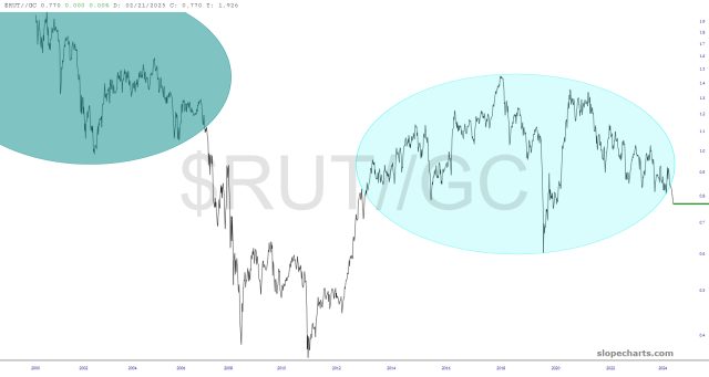
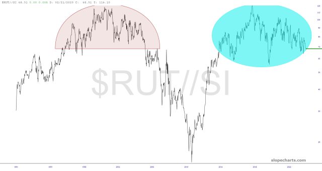
This ratio charts are so much more meaningful than their component parts. The story is simply: small caps are in trouble, and precious metals are going to shine.
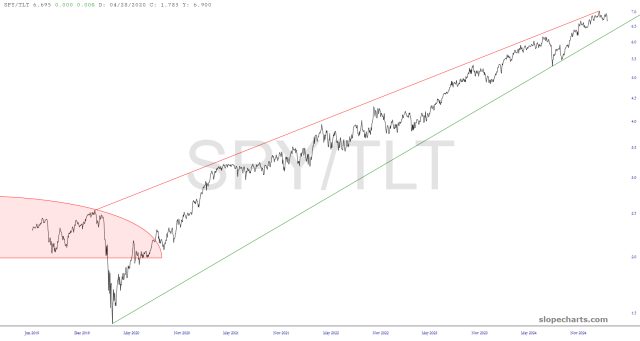
And when the happy day comes that the equities/bond ratio chart also cracks, look out below.