This is a survey of the biggest winners, on a percentage basis, over a number of time-spans. Below I have created galleries in SlopeCharts of the best gainers for 2019, the past five years, the past ten years, and the past twenty years. I want to emphasize two things: (1) even though I just told you, I’ll say again these are percentage charts, not normal charts; (2) if you want to see the big version of any chart, click on the thumbnail. Unfortunately, the left/right arrows don’t let you navigate the entire set, so you need to click on any specific chart to see it.
(more…)Slope of Hope Blog Posts
Slope initially began as a blog, so this is where most of the website’s content resides. Here we have tens of thousands of posts dating back over a decade. These are listed in reverse chronological order. Click on any category icon below to see posts tagged with that particular subject, or click on a word in the category cloud on the right side of the screen for more specific choices.
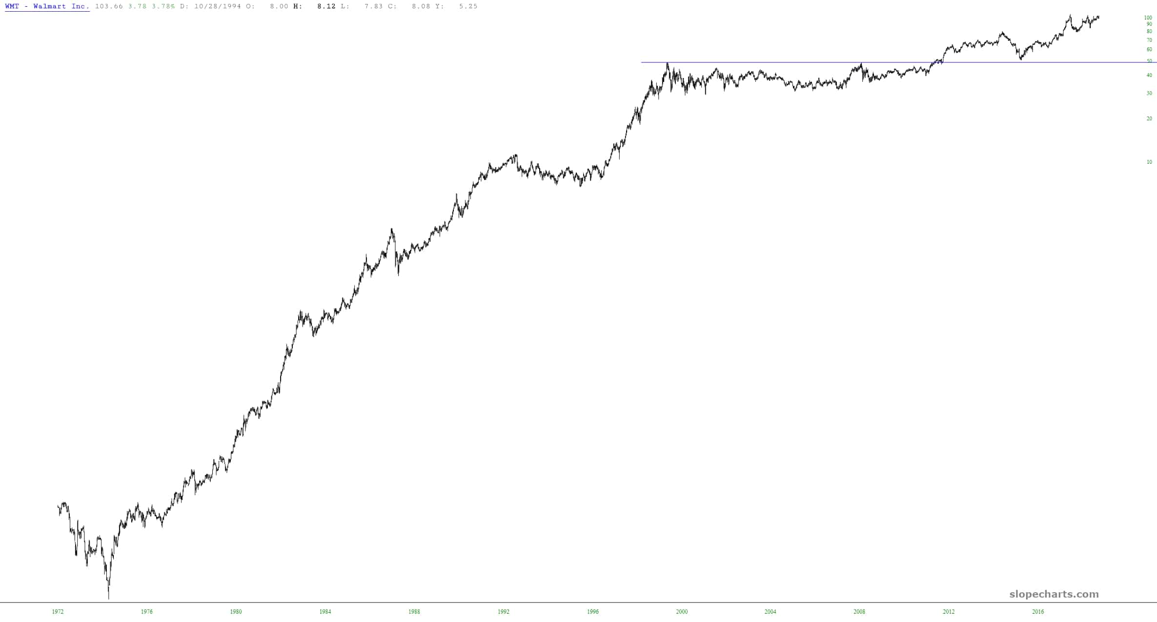
The Wonder of Walmart
WalMart came out with earnings this morning, and it looks like another record high for this giant retailer, whose value is approaching $300 billion. If you were from an alien world and saw this chart, you would logically conclude that the United States has never had a bear market, not even once. This stock does one thing only: it goes up.
Ten. Long. Years.
One decade. One decade has now elapsed between the fabled 666 bottom and now. Think about the world in March 2009. Obama was still finding his way around the White House. Facebook was a private company. Netflix was five bucks a share. And ZeroHedge was just a few weeks old.
And as a surprise to those who might consider me a die-hard permabear, I offer a post from that very day, March 6th, 2009, entitled Tim-Bull – –
(more…)This is not to say I’ve gone “all long”. I have, spread out among my accounts, 176 positions. 64 are long, 72 are short, and 40 are options (all of them puts). So on a position-count basis, I am more bear than bull. But on a cash basis, I’m more bull than bear, particularly since some of my long positions are well into the six figures.
Some Perspective on AAPL

Who’s Winning?
Don’t let my Herculean physique fool you. I’ve never been an athlete. Not even once. In fact, I don’t even like perspiration. The only exercise I get is swimming, and that’s because I don’t have to deal with sweat, which I find sort of ewwww. So, yeah, I’m a man’s man.
My beloved children, however, are all top-notch fencers, and they tour internationally. We travel as a family, the gallant Knights and their swords, which on occasions like this pulls me somewhat away from my normal prolific nature.
(more…)