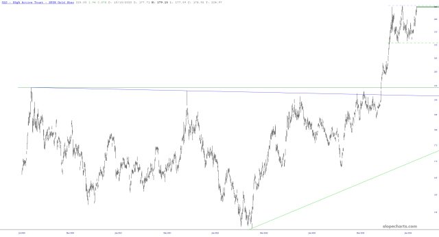
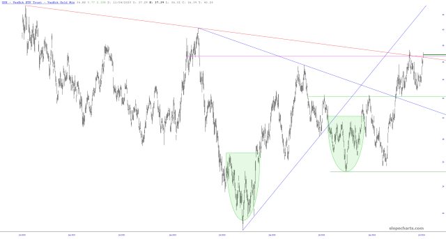
Gold, as most of you know, is one of the few assets whose ascent I consistently cheer. I’m very pleased to see GLD approaching levels never seen before.
Slope initially began as a blog, so this is where most of the website’s content resides. Here we have tens of thousands of posts dating back over a decade. These are listed in reverse chronological order. Click on any category icon below to see posts tagged with that particular subject, or click on a word in the category cloud on the right side of the screen for more specific choices.
Gold, as most of you know, is one of the few assets whose ascent I consistently cheer. I’m very pleased to see GLD approaching levels never seen before.
Let’s get back to the financial markets. Permanently, I think.
I’ve been a bit obsessed with gold, but I wanted to see data beyond just the past couple of decades, so I dug a lot deeper. I have constructed for you some charts from Excel that present over a century’s worth of gold prices. The first one is daily data back to 1968, updated through this week, on a standard arithmetic scale.
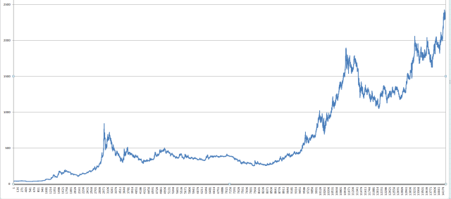
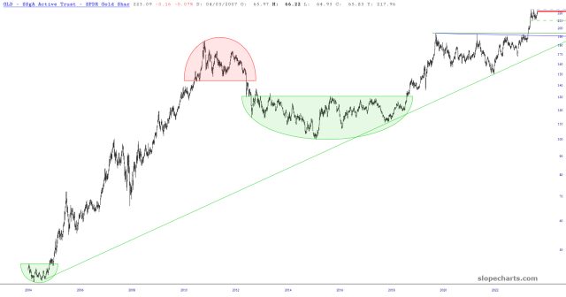
No matter what angle I look at gold, it looks long-term bullish. I’m a bit paralyzed by the idea that the moment I plunge into it feet first, it’ll start to fall. There is, I confess, about 15% of potential downside (which is the $2100 buy point I kept yearning for, but never materialized). Measured over years, however, it seems exceptionally positive for gold.
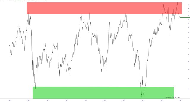
I’ve always been fascinated by the GDX/XME ratio. It has been cyclic for literally decades, and after reaching a lifetime high in February, it has been tracking downward nicely. I suspect it has years of plunge left in it.