
Let’s get back to the financial markets. Permanently, I think.
I’ve been a bit obsessed with gold, but I wanted to see data beyond just the past couple of decades, so I dug a lot deeper. I have constructed for you some charts from Excel that present over a century’s worth of gold prices. The first one is daily data back to 1968, updated through this week, on a standard arithmetic scale.
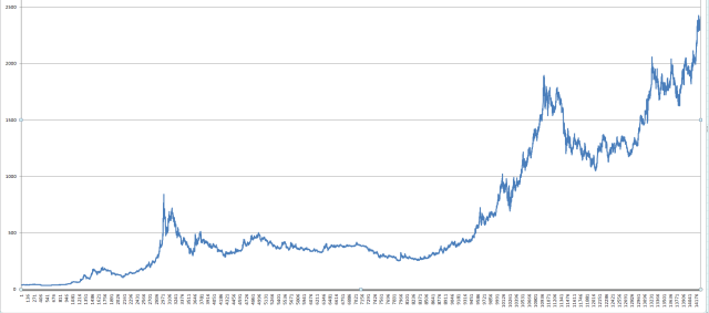
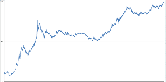
By adjusting the y-axis, and showing it as a log scale, the presentation is a bit more useful. The price is quite high in nominal terms, naturally, as we are at some of the loftiest levels in history.
But we can dig much farther back on a cruder granularity. Here is the monthly data for gold going all the way back to the formation of the beloved Federal Reserve. Importantly, these prices are adjusted to take inflation into account, presenting a more useful, normalized picture.
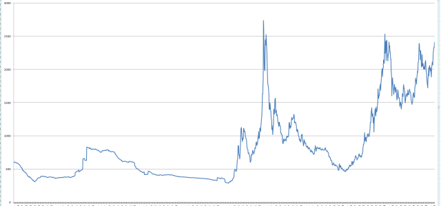
In this case, changing it to a log scale doesn’t make the graph look as freakishly different, because the horrid inflation of the past 110 years has done most of that for us. Below, then, is the “purest” representation of where we are at with gold.

So, on the one hand, it is very expensive (even normalized) and is at a price level which, historically, has been the peak. This kind of scares me. On the other hand, are we about to enter such a fundamentally different world that it is going to break out to a price that hasn’t been seen before and reach the kind of $5,000+ level that I think is possible?
It would be interesting for folks to share their thoughts, based on these rare charts I’ve been able to create. And, with that, I shall bid you farewell and see you Monday morning.
