Slope of Hope Blog Posts
Slope initially began as a blog, so this is where most of the website’s content resides. Here we have tens of thousands of posts dating back over a decade. These are listed in reverse chronological order. Click on any category icon below to see posts tagged with that particular subject, or click on a word in the category cloud on the right side of the screen for more specific choices.
Run Away from Home
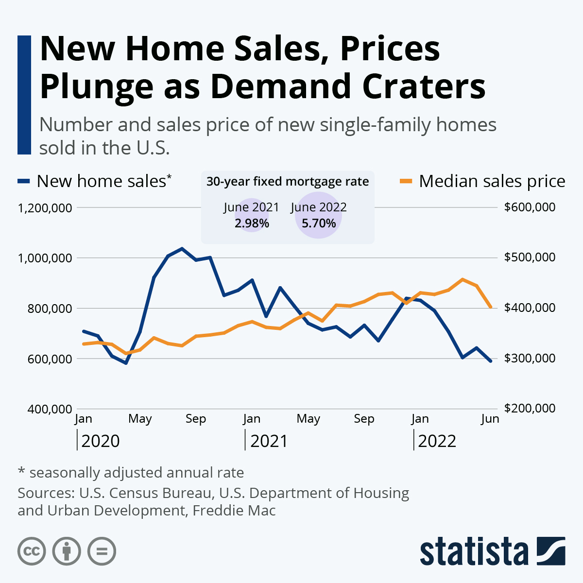
Home prices are still strong, but the strength behind those prices (AKA the volume) is on the wane.
Real Estate Returns
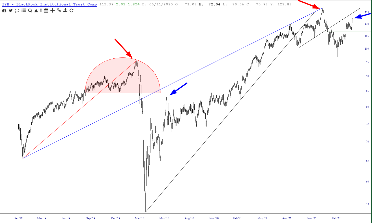
As sickeningly green as today is, one fund which is still rock-solid (and indeed has presented itself anew as a shorting opportunity) is our old friend IYR, the real estate fund. I shorted this today with a stop-loss at 97.40:

Durham, Revisited
Revisiting Real Estate
I’ve read some grumbling and hand-wringing with respect to the real estate fund symbol IYR, whose analog I’ve mentioned a number of times. It’s certainly been stubborn about weakening, but I wanted to provide this perspective on what the fund has been doing. My perception is that the strength has been carrying it to major resistance (represented by the blue arrows), having followed a major price peak (red arrows).