We’ve added a very exciting new feature to SlopeCharts: hierarchical sectors. We’ve also added a lot of little improvements to the data panel in general, which you’ll surely notice when you try it out. Click the arrows and go through the different modules in the data panel. Try clicking on the title of each section to see how it behaves, and also notice what right-clicking symbols does now. It’s all coming together.
(more…)Slope of Hope Blog Posts
Slope initially began as a blog, so this is where most of the website’s content resides. Here we have tens of thousands of posts dating back over a decade. These are listed in reverse chronological order. Click on any category icon below to see posts tagged with that particular subject, or click on a word in the category cloud on the right side of the screen for more specific choices.
Sectors Approach
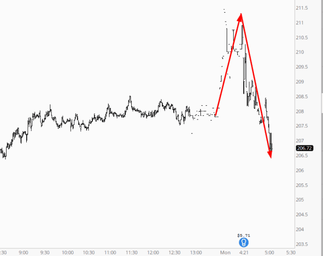
Earnings season has begun! Huzzah! Although the two big bank announcements this morning (GS and C) are being pretty indecisive:
Behold the Data Panel
I am absolutely thrilled to announce an improvement to SlopeCharts that I believe will be transformative: the Data Panel.
Now, on the surface, some of you may look at this thing and say: “So what?” Perhaps you aren’t as zealous about SlopeCharts as I am. But, I can assure you, it’s a big deal.
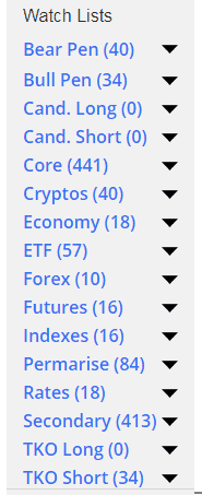
Those of you who have played with SlopeCharts even a little bit know that, to date, the leftmost portion of the product was dedicated to watch lists. That is still the case, but now we’ve transformed it into an area that can hold all kinds of information. Here’s a taste:
(more…)Name This Box
I need your help.
As any of you SlopeCharts users know, there is a rectangle on the left side of the screen which houses all the watch lists.
Look Sharp!
Next time to go to SlopeCharts (and if you haven’t tried it, you really must), you will see some changes (to be sure, press Ctrl-F5 on the keyboard to forcibly fetch the latest version). The program still works the same, but we’ve made it look cleaner and sharper.

