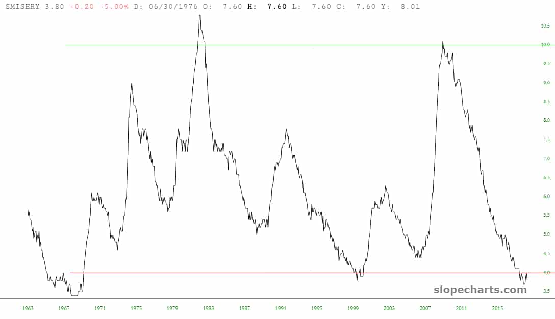
Here’s an interesting little experiment. I pulled up SlopeCharts and entered the symbol $MISERY (yeah, my kinda symbol), which shows the “misery index” of inflation and unemployment. I drew two lines, one at 10 and one at 4. Over the span of this chart, MISERY went above 10 twice and below 4 three times (the most recent of which was, oh, right about now).