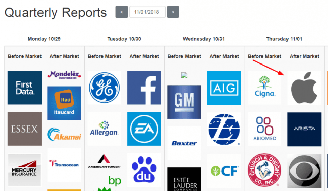
Of all the hundreds of companies reporting this week, there is one that stands head and shoulders (so to speak) above all others, and it is this:
Slope of Hope Blog Posts
Slope initially began as a blog, so this is where most of the website’s content resides. Here we have tens of thousands of posts dating back over a decade. These are listed in reverse chronological order. Click on any category icon below to see posts tagged with that particular subject, or click on a word in the category cloud on the right side of the screen for more specific choices.
Stretch Those Charts!
Yesterday I did a post about the new Polygon Tool in SlopeCharts. We’ve also added a cool feature that requires a little explanation.
I created a lot of never-done-before innovations in charting with JavaCharts and ProphetCharts, many of which are industry standards today. One of them was the notion of providing extra space on the right side of the chart, so you could have the opportunity to peer into the future with price projections. I find the ability to look into the future (even without the benefit of price bars) to be crucial when drawing objects and trying to contemplate price projections.
I included feature this with SlopeCharts, but until today it was always a fixed amount of time. We’ve now given you the ability to “stretch” the x-axis to give yourself more of the future. You just point to the x-axis scale and drag the mouse to the right. The silent video below shows how this works.
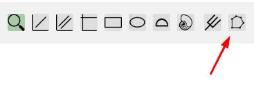
Polyamory in SlopeCharts
I am extremely pleased to let you know there is another drawing tool in SlopeCharts, and it is one I’ve been eager to see for a while: the polygon tool.
This new tool is the rightmost on the drawing tools palette.
Volatility Improved
As you may recall, volatility charts are an exclusive feature for Diamond members in SlopeCharts. I recently received an email from one of Slope’s Diamond members asking if we could improve the volatility pane so that it could show multiple types of volatility at the same time. Well, I’m pleased to show you this………..
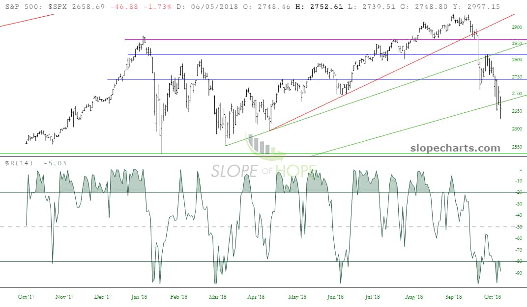
Indexes and the Willliams %R
Even though I’ve given SlopeCharts a nice suite of technical indicators, I hardly ever use them. I often mention that I don’t really use indicators much, almost to the point of being strident about it.
I must say, however, that having gone through the cash indexes with the %R indicator today, I’m pretty impressed, and it just adds to the body of evidence that I think it’s bounce time (I sure hope so!) Keep in mind that you can move the horizontal line dividing the price from the technical indicator pane, allowing you to make the indicator taller, as I have done below. So here we are: