Slope of Hope Blog Posts
Slope initially began as a blog, so this is where most of the website’s content resides. Here we have tens of thousands of posts dating back over a decade. These are listed in reverse chronological order. Click on any category icon below to see posts tagged with that particular subject, or click on a word in the category cloud on the right side of the screen for more specific choices.
Your Tax Dollars Hard at Work
Sunday’s News
I just wanted to drive home the point about how insane the market has become by reflecting – once again – on Sunday's news and how this "bull" market reacted.
There were two big pieces of news:
(1) Ireland was a basket case and, facing financial calamity, received a $100 billion+ bailout package;
(2) North Korea proudly made it known via a U.S. scientist that they were waaaaaaaay ahead of what anyone suspected with respect to the refinement of large amounts of nuclear fissile material.
So what did the market do on Sunday? Rally, of course! Big time! Because…….I dunno……..the hopes of QE7 or something.
It's refreshing to see that the fact that North Korea has actually started bombing and killing has actually caused some bulls to consider that maybe the world isn't such a peachy place right now after all.
Technical Difficulties (by Springheel Jack)
My main charting computer went down yesterday afternoon and all my futures and live forex charts have gone down with it for the time being. I'll be doing computer open-heart surgery today and tomorrow to get back to normal service and for today I'm just using stockcharts, as that is web-based.
I've been expecting the current retracement to resolve bullishly and I'm still expecting that, but I'll spend some time today considering the possibility that this might go the other way. We're close to key support on SPX and key resistance on USD, and it's worth looking at where those levels are and what the implications are if they break.
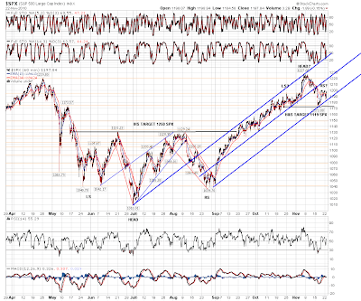
Firstly on SPX where after last week's low it is clear that SPX is in a rising channel that is a model of technical perfection. Here it is on the daily chart, and it really is a beauty:

Note also the parallel lines I have drawn in in red, as a mainly notional declining channel / range between January and October this year, and how last week's low retested the broken upper trendline perfectly.
Now that doesn't mean of course that this must resolve bullishly, but it does underline that as we stand today, the SPX move up from the summer lows is in robust technical shape, albeit also at major resistance levels, and until that changes the trend is still up.
There is some reason to think that this might resolve bearishly though. We are still close to the channel support trendline and a move below 1180 SPX now would break down through it. There is also a possible H&S forming, with a target at 1119 SPX, that you can see here on the 60min chart:
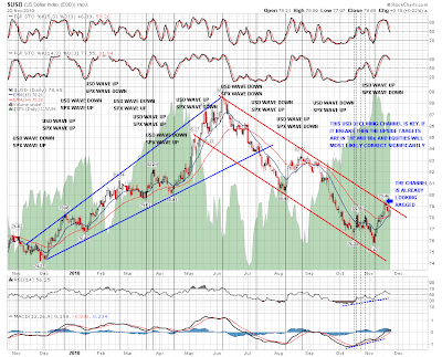
I've posted often before that equities and USD are strongly inversely intertwined, and that a break up on USD here would move likely end this wave up on equities. It's hard to believe that USD can do anything other than fall under the stewardship of the Fed, but some winds of change are blowing in the US, and it may be that the Republicans may be able to restrain the Fed from the reckless money printing that has dominated the last two years, and from the push to devalue USD that has dominated the second half of 2010 after the USD top in early June.
On the weekly USD chart we hit a key support trendline a few weeks ago, and it held on a weekly basis. If the bounce holds and breaks recent highs then there are two patterns in play. First is the triangle, with a target in the 87 area, and a rising channel upper trendline with a target in the 94 area:

First however, USD will need to break the declining channel from the June high. In practical terms a daily close over 79 would deliver that, and yesterday's close was at 78.69. The upper trendline of the channel has already been tested hard and is looking a little ragged now. It could break and this daily chart with SPX as the background illustrates the likely implications for equities if it does:
I've posted before a little right-angled and ascending broadening formation that I have on the Vix 60min chart. Here it is again, and unless the support trendline breaks, with a pattern target of 13 that I'm not taking too seriously, then the next move should be up with a target in the 23.5 area, which would obviously be negative for equities:

I've been reading a lot recently from Carl Futia and others that this retracement will go down further and then reverse to an upwards target in the 1300 area. I disagree, as we're clearly testing major support and resistance levels on SPX and USD respectively at the moment. If these break then this current equities uptrend will be broken, and the recent high was a major interim top. I'd be expecting a move then to retest support at 1130 SPX and that might well also be broken.
Until we see those breaks though, there's only one good risk / reward trade at an unbroken major support level, and that's obviously to go long. Only when that support breaks does the short trade become more attractive. I'll be watching for that support break on SPX, and the resistance break on USD, and if they happen the picture will entirely reverse, and the best risk / reward trades will be short equities / long USD.
Slicker Than Snake Oil (by Trade Flight Plan)
Irish whiskey, inventory levels, currency wars, and FOMC – whoopee!
Other than that, crude oil has been light, sweet, and volatile. As a quick followup to our prior post, we continue to watch the net positions of commercial entities on CL (now trading the CLF1 contract). Imagine our surprise when we see the commercials are actually increasing their net short positions to record levels based on the latest weekly Commitment of Traders (COT) info. These are airlines, producers, transportation companies, and other big hedgers.
Same rules apply as last time:
Red=commercial traders, yellow=small spec traders, blue=large non-commercial traders.
Green vertical lines show relatively high COT readings by the commercials. Red vertical lines show relatively low COT readings for these slick oil hedgers.
Just for kicks, we highlight with nice blue circles what happened previously when commercial net short positions hit new lows.
We cannot short at lows, and the snake oil salesmen haven't made it easy to get short, doing things like initiating the moves during Asian or European session hours at some crazy-o-clock in the middle of the night, blaming it on a supply disruption in Irish Whiskey as an excuse. But boy, any micro bull intraday retracements sure look interesting, especially if we can get some confirmation on smaller intraday time periods.
Even if all else fails, oil bulls would have to believe that somehow, this time things will be different and nearly 200,000 oil contracts net short of the nastiest, slickest, smartest traders in this business are just kidding. The best part is, an increase in the yellow line representing small speculators tells us that retail traders have been buying it.
Of course, in these markets anything is possible. In October/early November they marked price up by nearly $5/barrel before selling off, just to prove they could. The entire time, the commercials just kept establishing even larger net short positions. Someone's either going to get taken to the cleaners or make a fortune. Just stay alert if you're trading stuff based on oil, like USO, RIG, BP, XOM, etc. If CL sells off, they stand to make a nice profit. If not, end of year could get interesting.
