Slope of Hope Blog Posts
Slope initially began as a blog, so this is where most of the website’s content resides. Here we have tens of thousands of posts dating back over a decade. These are listed in reverse chronological order. Click on any category icon below to see posts tagged with that particular subject, or click on a word in the category cloud on the right side of the screen for more specific choices.
How Tim Would Feel About a Government Shutdown
Key Level on Australian Dollar (by Springheel Jack)
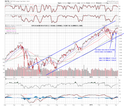
Another day of sideways chop yesterday, and SPX has built up a worrying series of topping candles. These don't always signal a trend change, but they do that much of the time, and that is a real concern here until overhead resistance is broken. Here it is on the SPX daily chart:
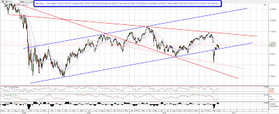
To add to the worrying technical picture, the Russell 2000 broke down from the recent rising channel yesterday, and that is a warning signal to consider seriously:

On the bull side NDX bottomed yesterday at one of my support trendlines and it might well hold there

I have mixed feelings about equities here and there is a real risk that we are seeing a double top on SPX if it can't break up from here soon. Copper has broken up very convincingly but if SPX just chops sideways until copper reaches the potential IHS neckline at 4.55 that would be a warning signal. As it is copper is still some way short of there, though it has broken 4.45 with confidence and looks likely to reach 4.55 next. I won't post the copper chart today as I already have seven other charts I'd like to post, and yesterday's chart still covers it well, but if HG/copper should retrace to 446, that should be a nice long entry level with a target at 4.55.
The US dollar had another bad night, and is now below 75.5. EURUSD has now reached the upper wedge trendline in the 1.44 area and we might see a reversal here:

The really interesting forex chart today though is AUDUSD, where AUD is hitting a four year rising wedge upper trendline intersecting with another 18 year support / resistance trendline. If we are going to see a reversal on AUDUSD anytime soon, this is the place. Here's the setup on the weekly chart:

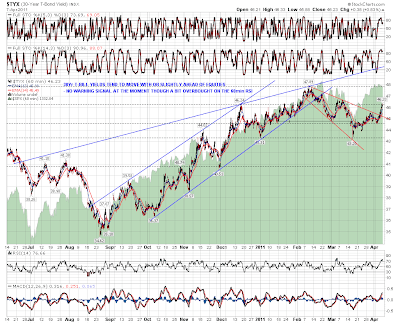
I was looking at 30yr treasury yields this morning for a directional clue on equities. That tends to trend up or down with equities, but sometimes weakens ahead of them. I'm not seeing any reason to think these are about to reverse seriously, though they're obviously overbought on the 60min RSI:
The last chart of the day is the very interesting chart for the Nikkei. I had a look at that yesterday after a talking head on Bloomberg suggested that Nikkei might be a long term buying opportunity. Looking at the chart, I'm inclined to agree, as the Nikkei has recovered and retested the broken rising channel lower trendline. As long as that trendline holds the Nikkei's looking pretty solid. :
I don't expect a serious equities reversal here, and I'm not really expecting to see one. There are some worrying signs of weakness though, and until ES and NQ break up through 1338 and 2350 respectively, there's definitely some reason for short term caution on equities.
Hedging Update (by Dave Pinsen)
Hey Fellow Slopers,
In our last hedging post, we looked at the cost of hedging the Dow (via the SPDR Dow Jones Industrial Average ETF DIA) and its components. This time, we'll compare the current costs of hedging the Dow with the costs of hedging the NASDAQ 100 (via the PowerShares ETF QQQ) and the S&P 500 (via the SPDR S&P 500 ETF SPY) and a few of their most widely-traded components. First, a quick recap of why an investor might consider hedging now.
We mentioned a couple of reasons last week:
1) Hedging had gotten cheaper recently, as volatility has declined. Volatility has come down a little more since our last post, with the VIX closing at 16.90 on April 6th, not far from its 52-week low of 14.86.
2) Prudence may be warranted with the end of QE2 scheduled for the end of June. Last week we quoted David Rosenberg, chief economist at Gluskin Sheff & Associates (formerly chief North American economist at Merrill Lynch, who noted that there had been an 88% correlation between the movements in the Fed balance sheet and the direction of the S&P 500 over the last two years. Rosenberg thought there would be a QE3, but maybe not until next year. I didn't catch it until this week, but apparently Marc Faber told Bloomberg last week that he also expects that there'll be a QE3, but not right away. Faber also said that the Fed might welcome a stock correction as a rationale for implementing QE3 ( at about 3:30 of this clip).
With that covered, below is a table showing the current costs of hedging the Dow, NASDAQ, and S&P 500 tracking ETFs and a few of their components, against greater-than-20% declines over the next several months using the optimal puts (I used the Portfolio Armor iOS app to pull up the optimal puts for these securities, but you can also use the web app versions of Portfolio Armor). First though, a reminder of what "optimal" means in this context, and also an explanation of why I picked 20% decline thresholds.
The optimal put options are the ones that will give an investor the level of protection he wants at the lowest possible cost. Portfolio Armor uses a proprietary algorithm developed by an all-but-dissertation finance Ph.D. candidate to find the optimal contracts to hedge stocks and ETFs.
You can enter any percentage you like for a threshold when using Portfolio Armor(the the higher the percentage, the greater the chance you will find optimal puts for your position). The idea for a 20% threshold comes from a comment fund manager John Hussman made in a market commentary in October 2008:
An intolerable loss, in my view, is one that requires a heroic recovery simply to break even… a short-term loss of 20%, particularly after the market has become severely depressed, should not be at all intolerable to long-term investors because such losses are generally reversed in the first few months of an advance (or even a powerful bear market rally).
In the table below, unless marked with an asterisk, the optimal put option contracts for the security expire in October; one asterisk indicates the options expire in September; two asterisks indicate that the options expire in November.
Disclosure: I'm holding a few puts on DIA.
|
Symbol |
Name |
Cost of Protection (as % of Position value) |
|
INTC |
Intel |
2.81% |
|
CSCO |
Cisco Systems |
2.1% |
|
MSFT |
Microsoft |
2.29% |
|
ORCL |
Oracle |
2.23%* |
|
BAC |
Bank of America |
4.66%** |
|
F |
Ford |
4.39%* |
|
GE |
GE |
2.09%* |
|
PFE |
Pfizer |
1.72%* |
|
WFC |
Wells Fargo |
2.96% |
|
T |
AT&T |
1.48% |
|
AA |
Alcoa |
4.8% |
|
QQQ |
PowerShares QQQ Trust |
1.34%* |
|
SPY |
SPDR S&P 500 |
1.06%* |
|
DIA |
SPDR Dow Jones Industrial Average |
0.81%* |
*Based on optimal puts expiring in September, 2011.
**Based on optimal puts expiring in November, 2011.
