Slope of Hope Blog Posts
Slope initially began as a blog, so this is where most of the website’s content resides. Here we have tens of thousands of posts dating back over a decade. These are listed in reverse chronological order. Click on any category icon below to see posts tagged with that particular subject, or click on a word in the category cloud on the right side of the screen for more specific choices.
Shorting GLD at Top of Wedge
No Ship, Sherlock (Again)
The shipping companies keep falling like there's just no bottom. I wonder if that's telling us something?
Limbo Dancing (by Springheel Jack)
It's been interesting to watch the relative performance of the equity indices this week. Normally on a strong bull move we'd see NDX and RUT lead SPX, but although NDX has been leading here, RUT has been trailing a long way behind. I've added the comparative trendlines to this SPX chart and you can see than apart from NDX, all the main indices are trailing SPX here, including the equal weighted NDX, confirming the obvious, which is that this move up in NDX has been dominated by the big NDX components such as AAPL and GOOG:

I'm leaning bullish from here on balance and I'm looking at two patterns for short term direction. The first is a falling wedge that has developed on the ES 15min chart. This should break one way or the other today:

The second is on TF, where rising support from the low is now being tested. This is an interesting level as I still have a viable declining channel on TF and until that breaks up it is still very much in play. A break down through rising support would open up the lower channel target on TF, and that's under 800 now:

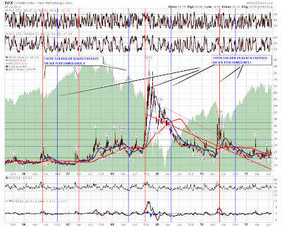
I saw someone referring to a golden cross on Vix that is taking place at the moment, so I've had a look at this. For anyone not familiar with these a golden cross is where the daily 50 SMA crosses the daily 200 SMA from below, and a death cross is where it crosses from above. These have been fairly impressive the last three years, and I've taken the view back six years to consider a reasonable sample of these. I've added a thick red vertical line for golden crosses (sell equities signal) and a thick blue vertical line for death crosses (buy equities signal). The crosses are hit and miss in my view, and the misses that spring most to the eye are the death cross in May 2008 that almost exactly captured the Vix low there, and the golden cross in May 2010, that almost exactly captured a Vix high then. You could argue that the May 2010 cross marked the flash crash then but by the time the cross was completed the flash crash was history, Vix had peaked, and SPX was in a bottoming process, so I wouldn't see this as a particularly successful signal. If the current cross is telling us anything, it is just a warning that the bears may not be finished quite yet:
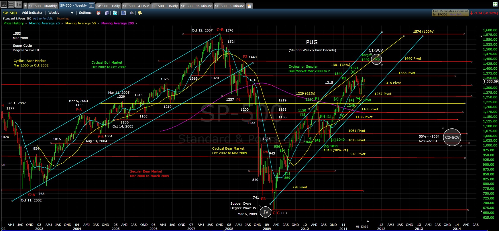
I have a friend over to visit this week,so I've been writing my morning posts and then going out for the rest of the day after I post them. I was in a bit of a hurry yesterday and mislabelled Pug's EW count here as 2 of P3, when in fact it is of course 2 of 3 of P5, with P5 being the fifth wave from the March 2009 low. Apologies for any confusion that my slip of the keyboard may have caused. You can always see Pug's overall view at his longer term SP500 page here, and that includes his SP500 weekly chart below:
As I've been writing ES and TF have both been breaking support. That's switching my short term view to bearish for today. Next decent ES support at 1315.50.
Afraid Of The Debtmageddon?
I borrowed the word from Lee Adler.
Right now it is easy to be afraid and difficult to be objective. So let’s review the market actions in that light.
SPX came down about 5 points today. Big deal! If there is going to be Debtmageddon , there should be mad selling. What the smart money is doing? Why are they not selling out yet? Once again, let us look at things with objectivity.
Below is the SPX daily chart.
We are above than where we were one month back.
Shouldn’t there be a sell-off of Bonds, pushing the yields higher? After all, the AAA ratings are about to go. Look at TNX, the 10 year bond yield indicator
Nope. The yield is still below 3% whereas the 10 year average is 4 %.
I am not a big fan of TA. I think when you torture the data for long; you can make it confess anything. So for each bull case in TA, there is a bear case, all from the same chart. However, let us look at the following hourly chart.
It looks like we have kind of a bottom or base.
For me more important is the money flow and I will borrow a chart from Lea Adler of The Wall Street Examiner. This is one indicator I follow amongst many other.
As you can see, cumulative net money flow is still positive and well above the SPX. Lee’s chart is “based upon the theory that as cash moves between money market funds and the banking system, there's a relationship between that movement and the movement of stock prices. As you can see, it has correlated well with stock prices over the past couple of years.”
In his latest email newsletter Lee writes as follows:
“It seemed that virtually every market observer expected that event to have a bearish impact. My expectation was that it would not be felt until mid July due to technical factors having to do with the Treasury supply settlement schedule. But over the past month, the indicator shown above began to surge, boosting support for the market just as the Fed was ready to step away.
Hysterical media pundits have been loudly proclaiming that the sky is falling as a result of the approaching US Debtmageddon. The markets, however, are revealing them as the know nothing clowns that they are. In fact, the opposite of their dire predictions has been occurring, with both stocks and bonds remaining resilient. The Treasury market is even rallying today after the uber depressing N'Obama Boner show last night. You gotta laugh.
The chart above makes clear the reason for this market resiliency. Money has been flooding into the US banking system over the past month. The source is apparently capital flight out of the Eurozone. While I don't track the data at the source of those flows, we know from anecdotal reports that there's been capital flight out of parts of Europe. Other US banking system indicators suggest that this is the source of the surge of cash into US bank accounts. The cash account balances of US based foreign banks have been surging in recent weeks. So have their trading accounts. Deposits in domestically chartered banks have also surged, but their trading accounts have not. It would appear that that the resiliency in the US equity market has been driven by foreign private buying. The Fed's data shows that foreign central banks have not been a factor. This is coming from the private sector”
For some reason private capital all over the world considers US to be safer than Europe and I suppose they know more than I do. But this is one reason I have not gone short yet.
But I am not blindly long and I may switch sides all of a sudden inter-day and shout “let’s get out”. Follow me on Twitter to get my latest calls.
Once again, make no mistake; these are all part of forming the top. But we do not want to go short when the market is still going up. That is not smart. I talked about 27th July before and we are almost there. For me the most crucial dates are between 27th of July to 5th of August. And I willl be watching the market activities closely to see if my calls are still valid. You see, I do not mind bring wrong, but I do not want to be wrong for a long time.
If you like what you are reading, please forward it to your friends. http://bbfinance.blogspot.com/
