
I just completed a book that’s been on my reading list for quite a long while. It’s by a Hungarian dancer called Nicholas Darvis and is titled is “How I made $2,000,000 in the Stock Market”. The book is written in the first person and chronicles Mr. Darvis’ journey in investing during the 1950’s.
The book is short and interesting. Mr. Darvis made nearly all the mistakes every novice trader makes and getting this firsthand account was quite entertaining. Mr. Darvis, a long only investor, was only successful when taking positions after a breakout. When the trade wasn’t going in his favor (a false breakout), he exited the trade quickly. Price was not important except for establishing a range (or “box” – known today as the “Darvis Box”).
Once he saw a breakout, he took a position. In fact, he mostly took positions only when the stock moved to higher prices. He bought high and sold higher. As the price rose, it would establish a new box range. If price fell below the bottom of the highest box range, he would exit. This way he followed the breakout trend until the trend ended.
Because he traveled the world as a famous dancer, he would get stock quotes telegrammed to him on a daily basis with only the high, low, open, close and volume being quoted. No other news. He looked at daily data but it would take weeks (if not months) for a range to be established. So he made his decisions on a time frame analogous to weekly or monthly time frames.
After he had made $500K (a lot of money for a dancer in the 1950’s I am sure!), disaster struck and he was nearly wiped out. What was the disaster? He went to work in New York and worked with other traders. The constant watching of the market, news flow and comments of other traders got him on the wrong side of the trade to the point of near bankruptcy.
He then traveled again, getting away from New York, and got back on track. Eventually, he made his way by to New York and set up trading in such a way that no broker could call him, he would not look at the market until after 6 pm (when the markets were closed) and then only by quotes being telegrammed to him, and he would send in his orders via telegram.
He basically replicated in New York, the remote and delayed conditions he experienced while travelling. There is a lot more to the story, but for me, what I found interesting was his successful technique of simply taking a breakout and riding the trend until price went below the most recent successively rising box. This not dissimilar to the charts I show here based on weekly data. On a long trade, there is a statistical breakout of a range and there is a rising stop based on other statistical calculations.
The book was worth reading (or listening) to. It may have taken place in the 1950’s but this is a very human story and I was constantly smiling at the similarities between then and now. Indeed, this book could have been written last week. Markets today may have different instruments and technology, but human psychology clearly has not changed and neither have human interactions in the markets.
Now on to this week’s charts.
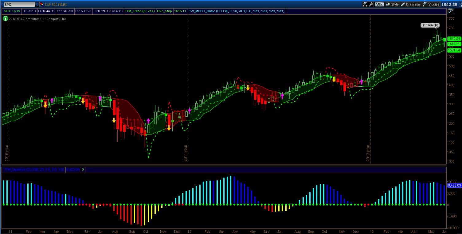
The weekly SPX chart below shows that the “weather warning” I issued last week is still in effect. As I stated last week, with the stop so close, it can be pierced but it will not be triggered until there is a weekly close below it. This is exactly what happened and we got the first piercing of the stop level since last November.
I also said that this can be hard ride out when this happens and I offered a suggestion as to how to deal with that scenario. This week, there is another early warning sign with a filled Heikin Ashi candle (see my introductory post for an explanation of HA candles). This follows the narrow body candle of the previous week. Momentum breakdowns are nearly always preceded by a solid HA candle (in the chart below, they always are) and the long stop is most often triggered by a one of these candles – but not necessarily the first one. Also note the declining candle tops and declining buy-side momentum on the Squeeze indicator.
So long risk still remains at a weekly close below 1615 and you are clearly wrong – if long – should price print a weekly close below 1581 (note, I’ve added the price bubble to the momentum bands).
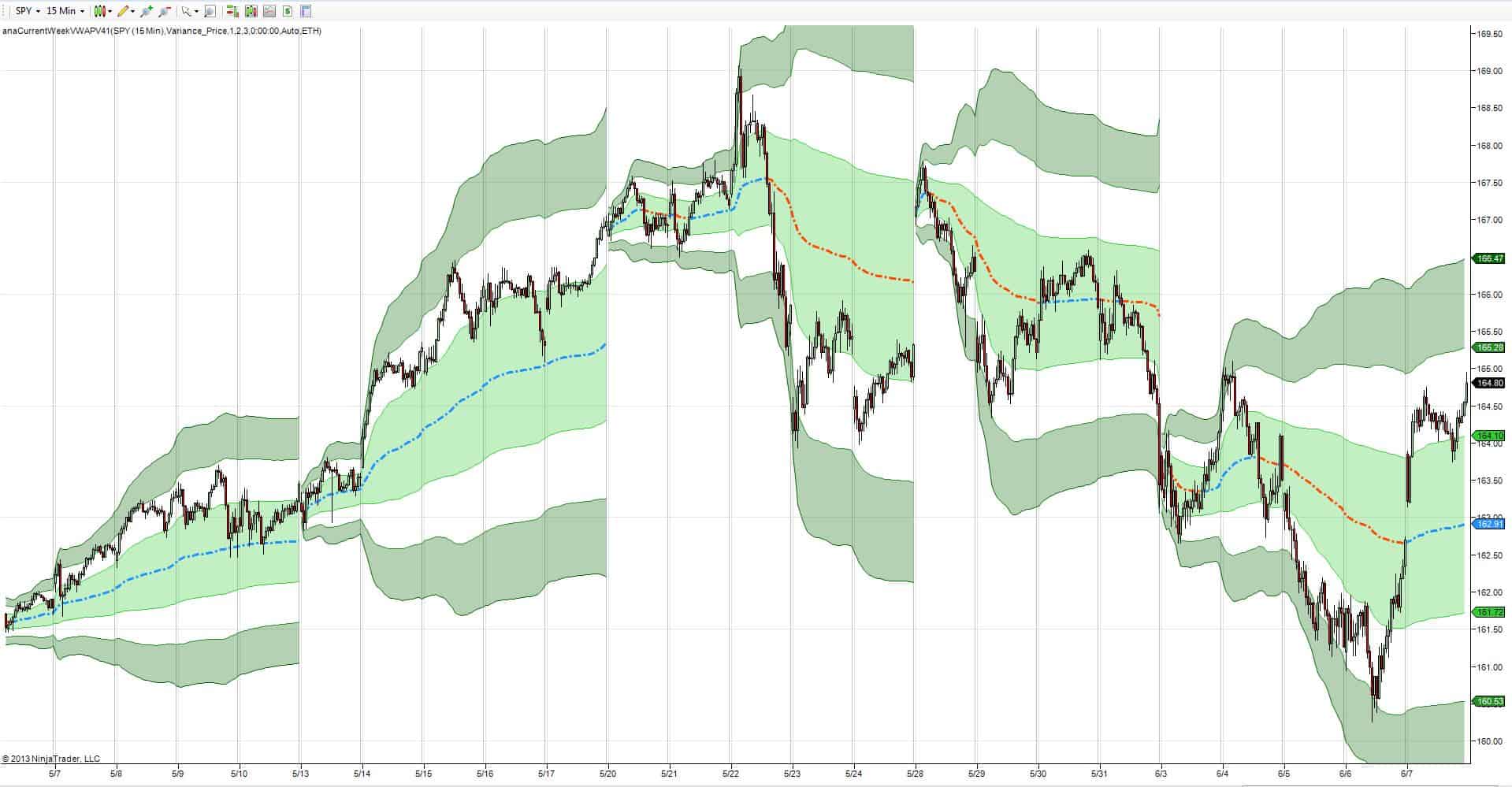
In the chart below, we see that the weekly SPY VWAP continues to decline as well. Yes, there was an upward price jump on Friday, but daily prices move around the weekly VWAP. I saw a few commentators trying to explain Friday’s action (job report mostly, good economic data, etc.). I try to think about the psychology of the move and perhaps it was nothing more than one of the big three fears at play. Namely, The Fear of Missing Out.
After all, the Buy-the-dip mentality presently at play would certainly stoke this fear. The other two Big Fears are: The Fear of Losing Money and The Fear of Being Wrong. Whatever the reason, I am working from the charts on a weekly time frame and so what happens on one day during the week, although interesting, is only just one day. And even with that one good day, the weekly VWAP is down for a third week in a row and now sits approximately where it was four weeks ago.
So there are several warning signs that the current market trend could be ending. They are just warnings. I have no idea what Monday will bring and I certainly don’t know what any other day after that will bring. We could rocket higher still keeping this trend alive or we could trigger the stop and even initiate a momentum break down. All I know is where the long risk of the trade is at today.
I am about to show several other charts that caught my attention this week. My comments on them will be brief.
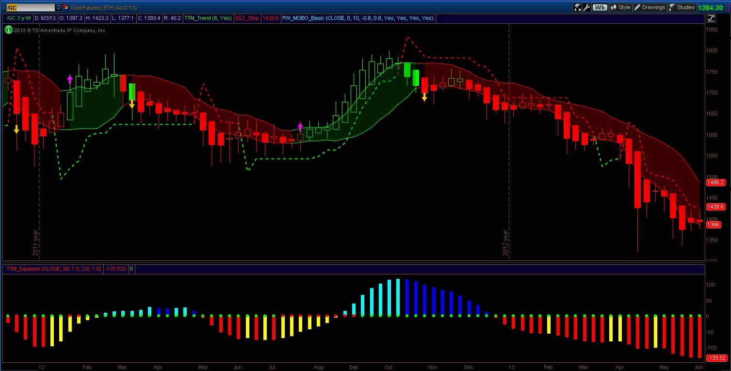
GC (below) is still in a downtrend with increasing sell-side momentum. Short exit trigger is on a weekly close above 1429.
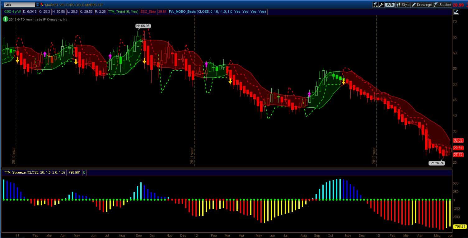
GDX (below) is still in a downtrend but price action is pushing up against the short stop. There are also two hollow candles which are early warnings that the trend might be changing. Sell-side momentum has moderated as well.
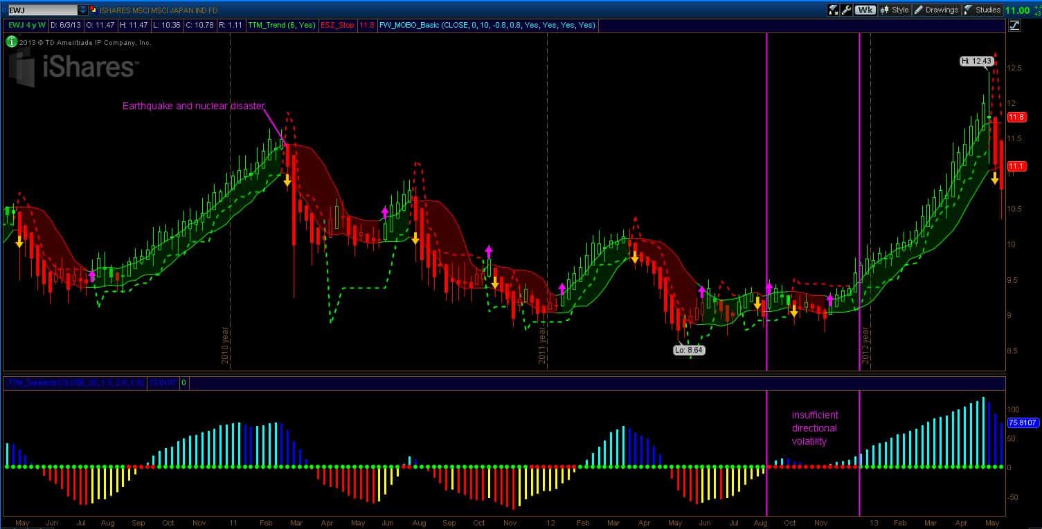
EWJ (below) shows the weekly read on Japan. The long exit (sell signal) was the previous week. I found it interesting to see what happened during the disastrous earthquake in March of 2011. The price movement that Friday was statistically significant and both the stop and the momentum breakdown closed out the previous long positions. That was a Black Swan event that no one could have forecast.
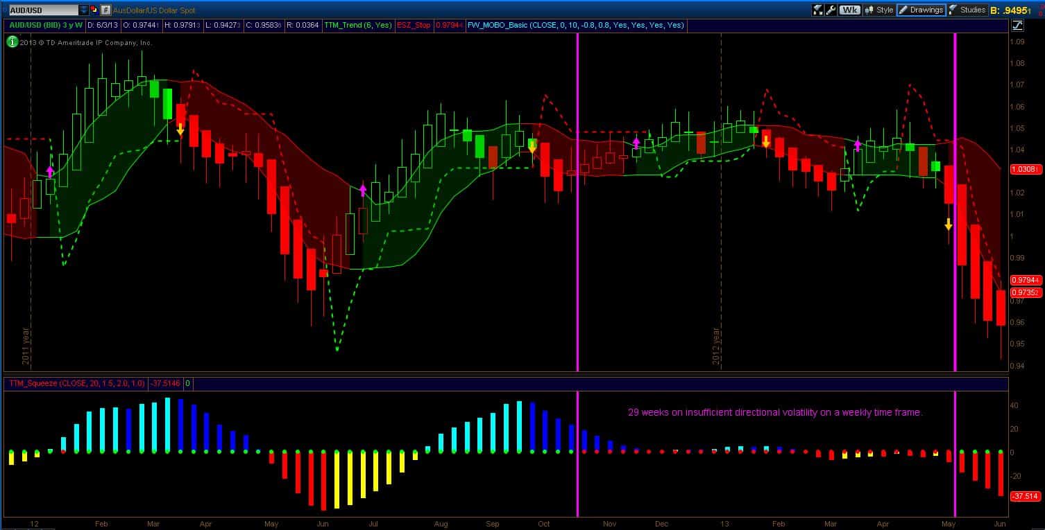
Finally, the AUD (below) is interesting for the length of time that it was in chop mode (as per the Squeeze). Yes, day traders had lots of short-term opportunities but on a weekly basis, but the AUD didn’t move with meaning until it finally broke down. There were plenty of warning signs before that happened (stop triggered and three filled HA candles). Once the AUD broke down, the fall has been precipitous. Selling momentum has been increasing.
Have a good trading week!
Dr. G.
