The following 1-year Daily charts are simply presented to show trend, support and resistance levels, and current price levels for the past year for a variety of U.S. Major Indices & Sectors, World Indices, Commodities, Forex pairs, and U.S. social media ETF & stocks.The accompanying 1-year percentage-gained graphs show the leaders and laggards for those groups. (more…)
Slope of Hope Blog Posts
Slope initially began as a blog, so this is where most of the website’s content resides. Here we have tens of thousands of posts dating back over a decade. These are listed in reverse chronological order. Click on any category icon below to see posts tagged with that particular subject, or click on a word in the category cloud on the right side of the screen for more specific choices.
Break, For God’s Sake
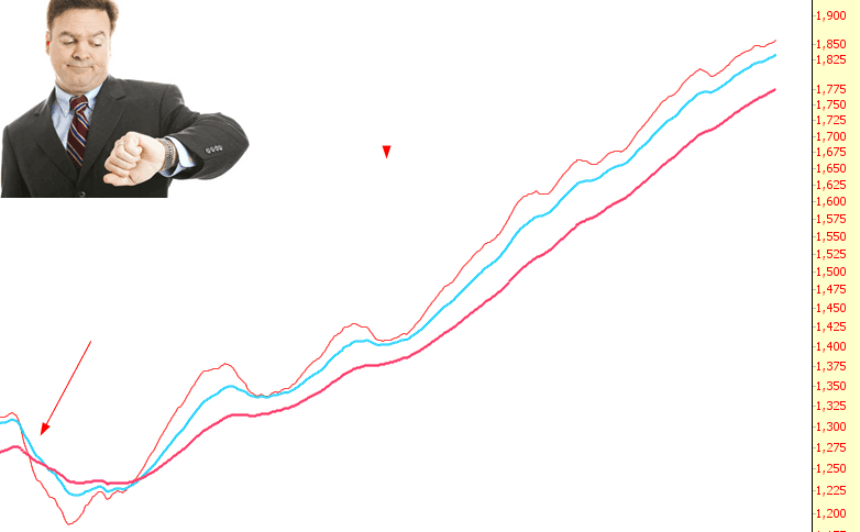
Early this week, on Monday morning, the market was melting like an ice cream cone on a summer’s day. It was glorious. Of course, that only lasted for a couple of hours. I had forgotten what that feeling was like, though – – where stock prices just slip without any bids. But as the chart below illustrates, there’s a reason such a feeling is as rare as hen’s teeth: the last time the market had honest-to-God weakness was nearly three years ago; as the exponential moving averages (in this case, on the S&P 500) illustrates, it’s just been a steady drift higher.
Drinks of Color

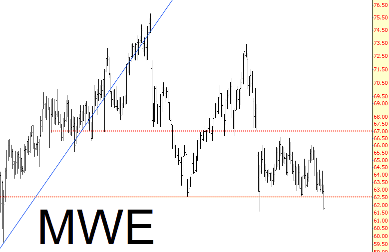
Markwest Heading South
I’ve had this short on for a couple of weeks, and it’s finally starting to break down nicely. I think there’s plenty of downside left.