Having looked at millions of charts over the years, my eyes have become pretty good at spotting patterns, including those that would be invisible to saner people. One example is Eastman Chemical, which is sporting what I consider a pretty impressive diamond reversal pattern: 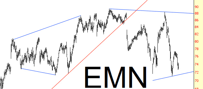
Slope of Hope Blog Posts
Slope initially began as a blog, so this is where most of the website’s content resides. Here we have tens of thousands of posts dating back over a decade. These are listed in reverse chronological order. Click on any category icon below to see posts tagged with that particular subject, or click on a word in the category cloud on the right side of the screen for more specific choices.
Swing Trading Watch-List: WFM, SLXP, NEM, ATVI, INTC

Suspended Sentence
Another day of selling yesterday, and SPX has lost over 2% over the first three trading days of 2015. This is fairly rare, having only happened eight times in the last 44 years, and it puts SPX on the clock for a possible rarer setup that would make the prospects for the remainder of the year look bleak.
Of those eight examples, three managed to close January above the close on that third day, which in this case would be 2002.61. Those three examples all put in excellent years, with the lowest rising 14.75% and the other two rising slightly over 26%. That is the SPX ‘get out of jail free card’ option.
Of the five others that closed January below the close on the third day, the best two full year performances were 1% and 3% gains, the next two lost 10% and 11% on the year, and the last lost an impressive 39% on the year (2008). If January closes below 2002.61, the historical stats would therefore suggest that the likely best case scenario would be a flat year. (more…)
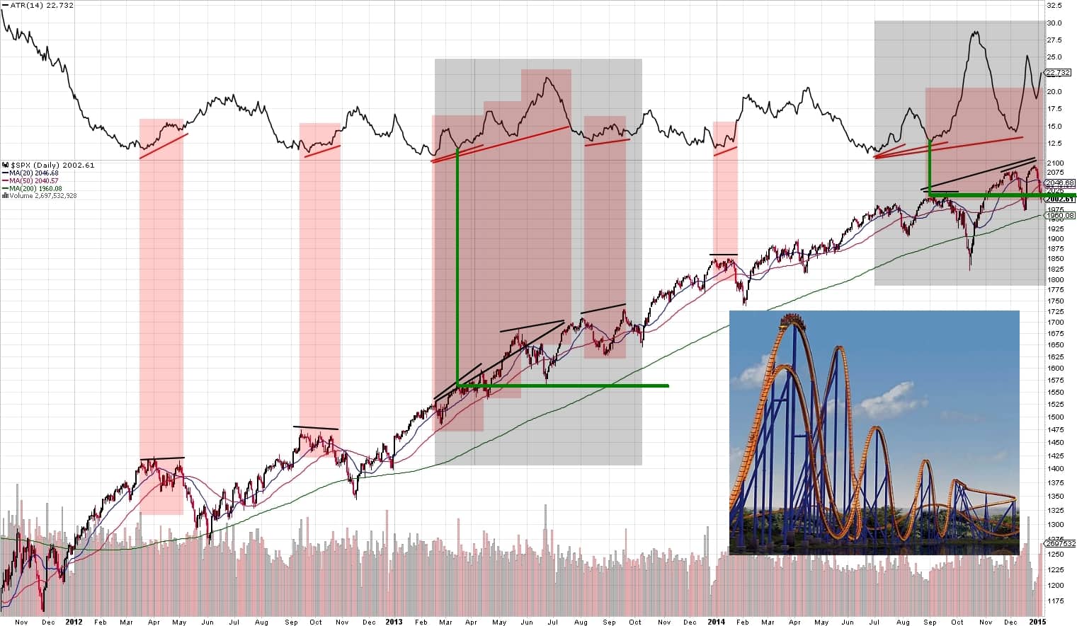
Not Your Average True Range
Hey folks, just wanted to share an observation I made today and my hypothesis that the market is at an adjustment point and working out where it’s going to go next. I share one single chart for your viewing enjoyment (click for larger view).