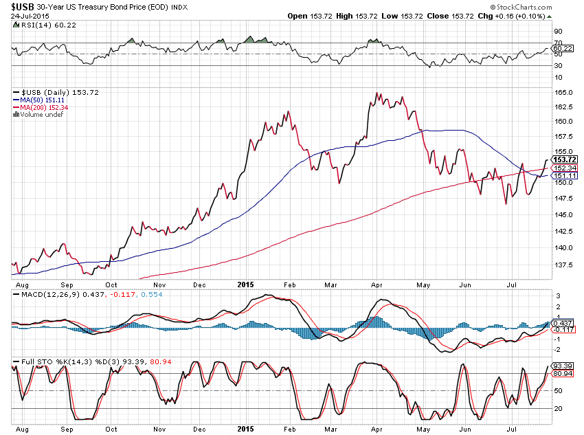
The following 1-Year Daily chart of 30-Year U.S. Bonds ($USB) shows that a bearish moving average Death Cross has recently formed — warning that lower prices may be in store. However, the rising RSI indicates building strength from May through July.
Slope initially began as a blog, so this is where most of the website’s content resides. Here we have tens of thousands of posts dating back over a decade. These are listed in reverse chronological order. Click on any category icon below to see posts tagged with that particular subject, or click on a word in the category cloud on the right side of the screen for more specific choices.
The following 1-Year Daily chart of 30-Year U.S. Bonds ($USB) shows that a bearish moving average Death Cross has recently formed — warning that lower prices may be in store. However, the rising RSI indicates building strength from May through July.
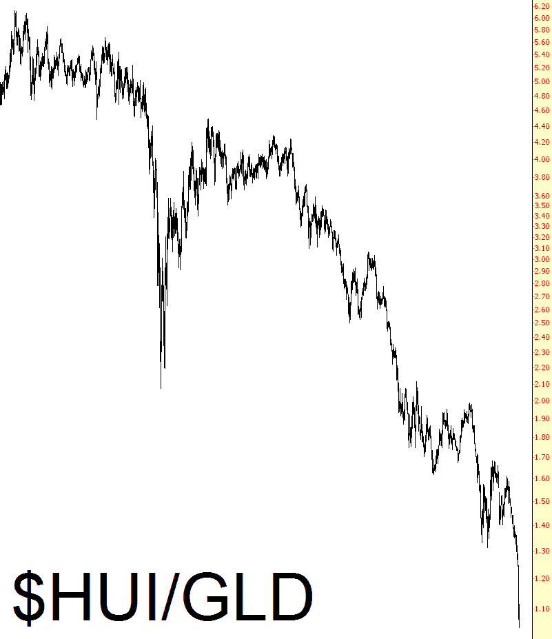
A reader pointed out to me that the ratio of the gold bugs index ($HUI in ProphetCharts) versus gold (GLD) had never been lower. I looked, and it actually had been lower back when gold was around $300 per ounce, but there’s no doubt that the chart is very, very stretched to the downside. I’m still counting on, and positioned for, a bounce in precious metals and the companies that mine them in the near-term.