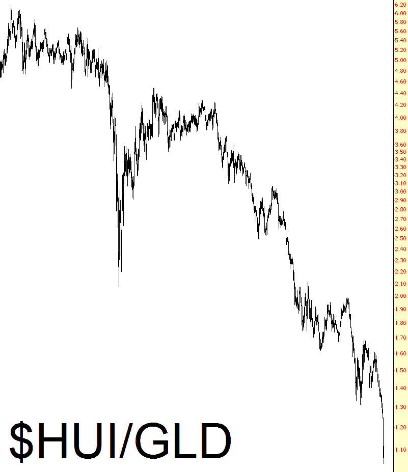
A reader pointed out to me that the ratio of the gold bugs index ($HUI in ProphetCharts) versus gold (GLD) had never been lower. I looked, and it actually had been lower back when gold was around $300 per ounce, but there’s no doubt that the chart is very, very stretched to the downside. I’m still counting on, and positioned for, a bounce in precious metals and the companies that mine them in the near-term.
Slope of Hope Blog Posts
Slope initially began as a blog, so this is where most of the website’s content resides. Here we have tens of thousands of posts dating back over a decade. These are listed in reverse chronological order. Click on any category icon below to see posts tagged with that particular subject, or click on a word in the category cloud on the right side of the screen for more specific choices.
The Gash with Panache
Droning On and On
My kids and I trekked over to the Stanford campus yesterday afternoon to try flying the drone. It worked out great. One of our little voyages was from the heart of the campus, and the other was from “Lake” Lagunita (now bone dry) where, near the end, you’ll see me waving from a sofa in the middle of the “lake.”
Steady As She Goes
I was just looking at some of the material from the latest Fed fumble, which was the leaked files of the Fed’s projections over the next five years. What a joke! Just take a good look at one of the charts. It’s breathtaking how freakin’ stable things suddenly get in the future, isn’t it? These are supposed to be our best and brightest economists, everybody.


