Slope of Hope Blog Posts

Slope initially began as a blog, so this is where most of the website’s content resides. Here we have tens of thousands of posts dating back over a decade. These are listed in reverse chronological order. Click on any category icon below to see posts tagged with that particular subject, or click on a word in the category cloud on the right side of the screen for more specific choices.

Weekend Review (Part 3 of 4)

By -

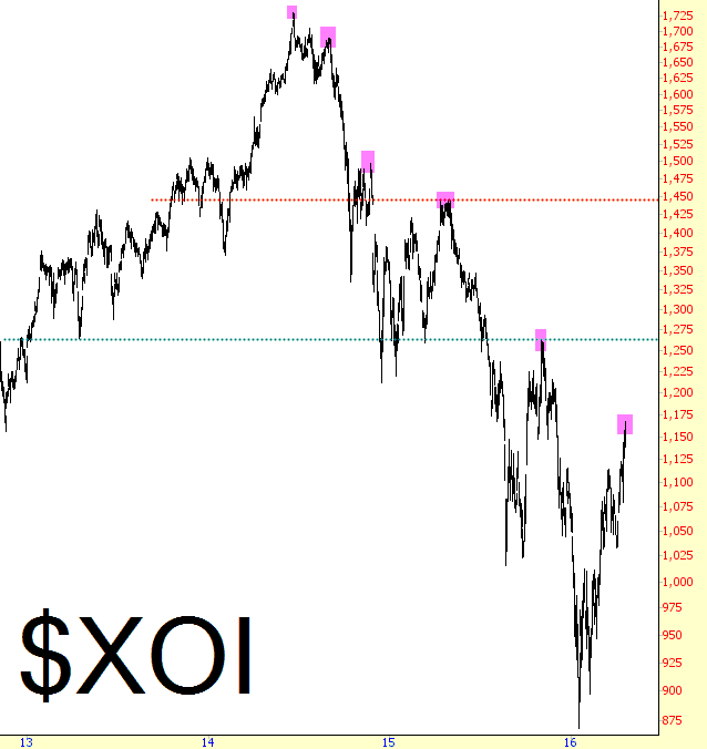
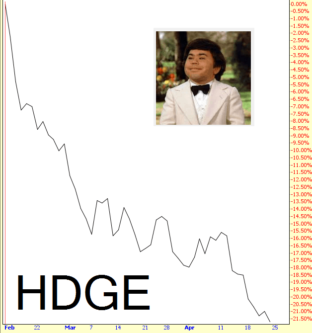
Happy Sunday to you, as we continue our general review of market charts. Just as the chart of HDGE, shown in part 1, illustrated how nasty the strength since February 11 has been to the bears, I’ve got a similar, much longer-term chart to share: SDS. This is the leveraged fund which moves at twice the percentage of the S&P 500 in inverted terms.

This chart goes all the way back to 2009, and as you can see, in all those many years, and with all that’s happened during that tremendous timespan, this has been a relatively steady, sustained slide. What’s most interesting is how “smooth” the slide has become, since the couple of bouts of “relief” the bears got (one in 2010 and one in 2011) have been completely smoothed over by a globe of central bankers whose credibility has been greatly solidified by the investing public.

0424-sds

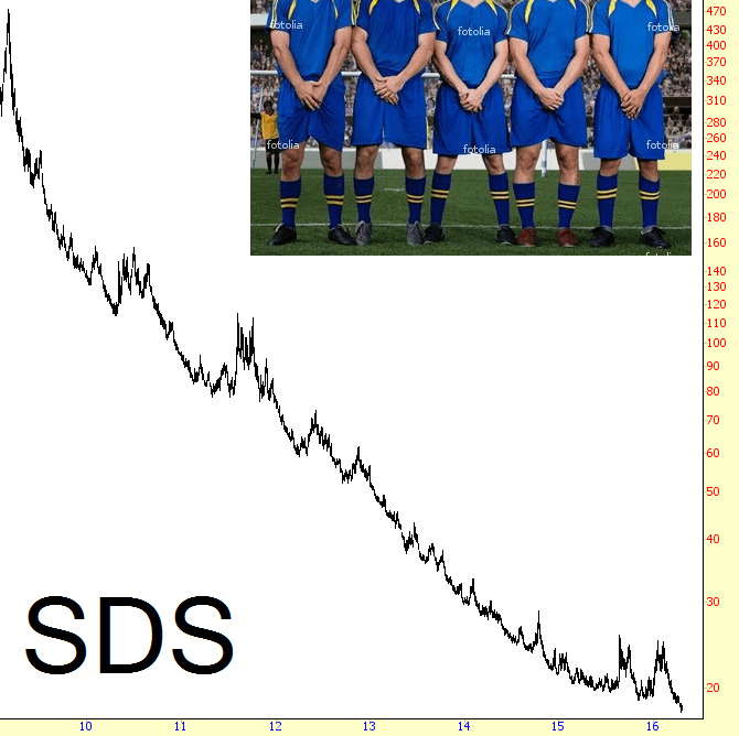
In the chart above, the last couple of gasps of hope came in August of last year, and then in the first portion of this year, ending on February 11th. This week, SDS went to new lifetime lows.

(more…)

Weekend Review (Part 2 of 4)

By -

Continuing on with our general market overview: if there’s one thing that has boosted the market more than anything else lately, it has been the recovery in the energy sector. As you’ll recall, 2015 was a disastrous year for energy, and the breakdown really accelerated in the first few weeks of 2016. It looked like countless energy firms were going to go bankrupt, the high yield bonds were falling apart, and oil itself was worth less than the barrels used to contain the stuff.

What’s crucial to remain mindful of is how all this time, the oil sector has been doing nothing but making a series of lower highs. Take a good look at the tinted prices below. There have been many “recoveries” along the way, the most recent of which has been the most violent. Until and unless it pushes past that green line at about 1270, however, the tremendous surge since January 20th is just that: another countertrend rally in the face of a long-term downturn.

vxoi

(more…)

Weekend Review (Part 1 of 4)

By -

This weekend I’ve gathered up 14 charts about the market in general and wanted to share a few words about each of them. I’ve spread these charts over four different posts, all of which will be available to everyone.

First off is a chart which expresses better than any other what a horrendous slog it has been for any surviving equity bears since the February 11th bottom. This is the fund with symbol HDGE which specializes in shorting stocks. It has a great start to the year, but after February 11th, it’s been a quadruple-diamond ski slope downward, with losses now approaching a quarter of its 2/11 value. There’s been pretty much no respite this entire time.

0424-hdge

(more…)