As most of you know, SlopeCharts is the web-based charting platform I created after the death of my former creation, ProphetCharts (killed by its purchaser, Ameritrade). I am exceptionally pleased with SlopeCharts, and I use it every day as the basis of both my trading and my writing.
SlopeCharts already satisfies all my needs, and for a while I figured I’d just leave it be and continue on my merry way. However, I made a decision recently to double down on my investment in this platform and add a lot of features that users have been requesting. Some of these features will be exclusive for PLUS users, and other features will be accessible by everyone.
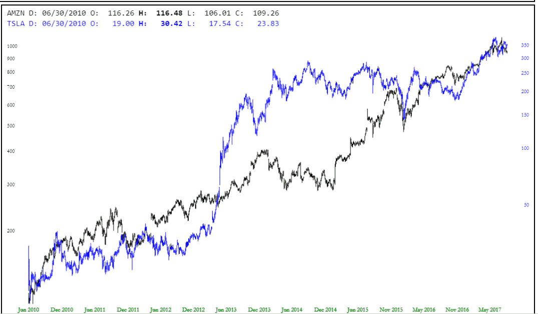
I am pleased to announce the first of these new features now, and it is a PLUS exclusive: Dual Charts. This allows you to observe two charts at the same time, each with its own y-axis. Using it is a snap – – just enter the two symbols you want to chart, separated by a comma (such as AMZN,TSLA):
Once you click Go or press Enter, voila, you get both charts on top of one another, each of them color coded. Also note that the data line is doubled, so you can see the open, high, low, and close information for each date of both symbols. In the chart example below, everything blue is related to TSLA (as you can see from the data line), and everything black is for AMZN.
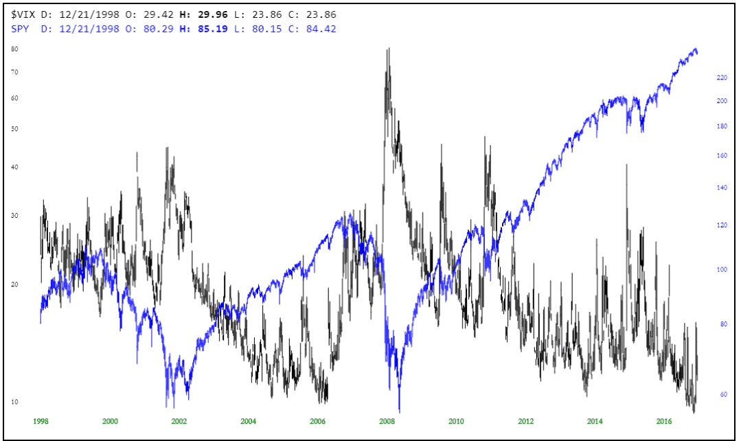
Here’s another example, overlaying the $VIX with the SPY (you can see how the $VIX has been smothered to death over the past eight years as the blue SPY line has soared relentlessly higher).
Although this new feature is just for PLUS subscribers, I want to state again how serious I am about expanding SlopeCharts’ features, the quality and variety of its data, and its reach to traders. My growing PLUS subscriber base has, bless ’em, afforded me the luxury of investing more heavily into this product and, incidentally, a face lift for Slope of Hope itself. You can expect many improvements to the blog and its charting platform in the weeks and months to come.


