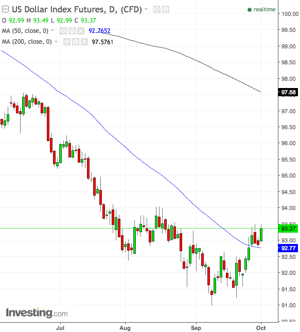
The US currency is up this morning and surprise surprise, gold, among other things is down (gold bugs should not be in worry mode, they should be in general preparation mode… and I don’t mean canned goods and Uni bomber shacks).
Meanwhile, the USD would not be disruptive for US stocks unless/until it gets impulsive and attends a flight to the risk ‘off’ side of the boat. Short of that, a rise in the dollar puts stocks on notice, but doesn’t croak them in real time (as evidenced by the 2014 up phase). Meanwhile, logical rotation is the theme.
If USD goes on to do what I think it will do, the declining black line AKA the 200 day moving average, is the target. So far, so good as Unc is making good progress at turning the MA 50 into support. I am very long pro-USD vehicles.
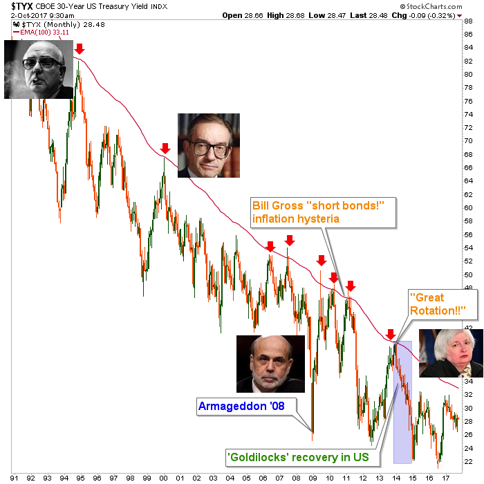
I love this cartoon and need to start having more fun with charts like I used to in the old days. It’s just that now work comes first, fun second. But look at those mugs, will ya? Volcker as ‘the Don’ or Godfather, Greenspan as the 60’s intellectual conservative gold bug anti-monetarist turned financial engineering Maestro, big brained Bernanke going Greenspan on steroids and finally the woman to the right, peering out at us with a look of apprehension like “WTF have I inherited?” both in terms of the continuum that came before her and the president under whose watch she toils.
The above chart was created in reference to this excerpt from NFTRH 467…
The 30 Year Yield Continuum ©
We’ve not looked at this simple chart of the 30yr yield in a while, so let’s reflect on it for a moment. The post-Volcker era has been populated by Fed heads that in my view have fed off of a secular decline in yields, never failing to promote inflation at the first sign of trouble, under cover the weak yields and thus, tame inflation expectations.
Every damn time the yield has spiked to the monthly EMA 100 (AKA “the limiter”) a deflationary pull has sucked it back down again, sometimes to near disaster like Armageddon ’08 and other times to blissful Goldilocks phases, like the post-2012 period.
I put this chart up to show how profound a change in the big picture of long-term rate dynamics would be. The silliness of the Dec. 2016 Bloomberg headline R.I.P. Bond Bull Market as Charts Say Last Gasps Have Been Taken is on display here. Yields have gone down (bonds up) since that very headline. But if the limiter is one day broken, everything is going to change. That is why we should pay attention to the Sentiment and CoT data in the segment directly above, not only for guidance on the yield curve, but also for guidance on the ‘long bond’ and by extension, future investment strategies.
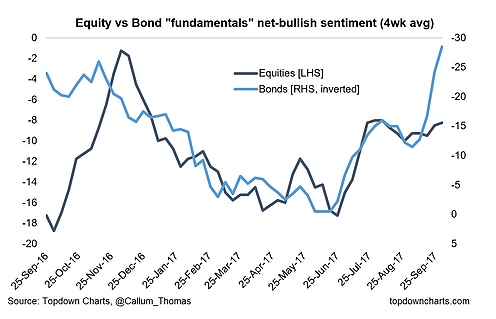
On a related matter, we did a lot of work in NFTRH 467 that indicated a CoT and sentiment backdrop that implies a steepening of the yield curve. Now, we all know how fickle and clumsy those things are from a timing standpoint (exhibit a: my dollar rally view), but new Biiwii contributor Callum Thomas (and thank you to the NFTRH subscriber who linked me to his site) has a survey that sees people as over bearish on bonds – the opposite of what the latest CoT and Sentiment data imply at Sentimentrader.
Our Sentimentrader view does show an over bearish sentiment profile for 2yr bonds, but the opposite for 30yr; hence the curve steepening implication. Anyway, here’s Callum’s graph of very over bearish bond fundamentalists. I am going to stay open minded all around (what else is new lately?).
Subscribe to NFTRH Premium for your 40-55 page weekly report, interim updates and NFTRH+ chart and trade ideas or the free eLetter for an introduction to our work. Or simply keep up to date with plenty of public content at NFTRH.com and Biiwii.com. Also, you can follow via Twitter @BiiwiiNFTRH, StockTwits, RSS or sign up to receive posts directly by email (right sidebar).


