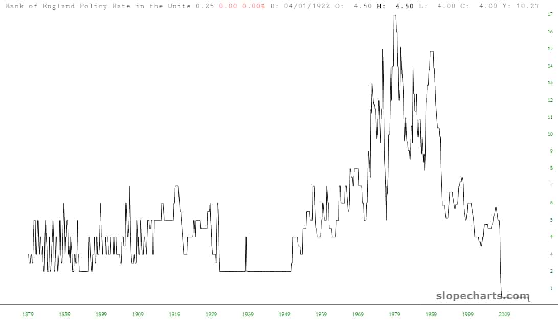
I was exploring the Slope Economic Database (which you can learn about here) and landed on some old data plots from England (yes, this is what I actually consider fun on the weekend). I thought I’d share a few of the charts here, since they’re pretty fascinating. As always, click on any chart to see a much bigger version. The description for each one is at the top of the chart.