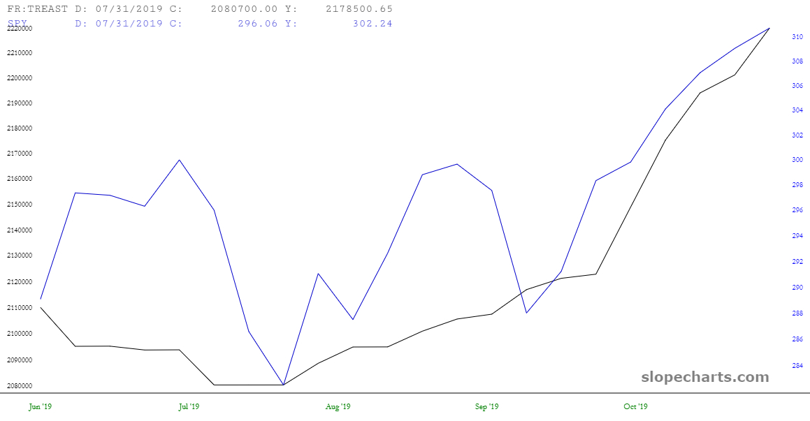
Although I doubt anyone here dismisses the notion that Jerome Powell’s welfare program known as QE4 isn’t the sole reason for the explosion in equity prices recently, I’d like to take advantage of SlopeChart’s comparison feature to show this:

Although I doubt anyone here dismisses the notion that Jerome Powell’s welfare program known as QE4 isn’t the sole reason for the explosion in equity prices recently, I’d like to take advantage of SlopeChart’s comparison feature to show this:
