
Further to my last post, the following pivot point calculations and charts are provided to illustrate a variety of support and resistance levels for three timeframes, namely daily, weekly and monthly, for the S&P 500 Index (SPX).
For a detailed explanation of pivot points, feel free to check out John Person’s website at this link (the creator of this pivot calculator) and use his calculator for your own purposes. Just input the respective candle’s high, low and close values to the second decimal point and press “submit.”
Generally speaking, it uses the prior day’s, week’s, or month’s high, low and close to calculate the following day’s, week’s, or month’s Pivot Point (PP) and its resistance values above and its support values below. Price action above the PP is considered bullish, and below, it’s bearish.
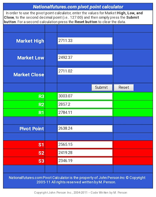
SPX Daily Pivot Point Values (for Monday March 16)

SPX Weekly Pivot Point Values (for the WEEK of March 16)
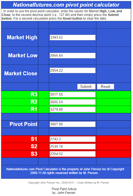
SPX Monthly Pivot Point Values (taken from the MONTH of February for March)
For a quick way to view the PP (pivot point) of each timeframe, I’ve shown it in a one-period moving average (hlc3) cross format (blue) on each of the following daily, weekly, monthly, and last monthly charts.
Friday the 13th closed at 2711.02.
So, for example:
- The daily PP for Monday March 16 is 2638.24 — N.B. Friday closed above that value, as well as Thursday’s PP at 2540.15, so it closed bullish on the day, as well as compared with the prior day.
- The weekly PP for the week of Monday March 16 is 2687.4833 — N.B. Friday closed above that value, so it closed bullish for the week, but still bearish below the prior week’s PP at 3003.5434.
- The monthly PP taken from February for March is 3067.86 — N.B. Friday closed well below that level, so it is bearish on the prior month, so far. ***(NOTE that March’s PP is currently 2772.7333, based on this month’s trading action, thus far, and will change before month’s end, the final value to be used for trading in April — N.B. Friday closed below that value, so it is bearish on the current month, so far.)

SPX Daily chart
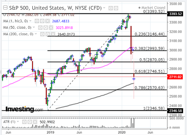
SPX Weekly chart
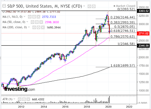
SPX Monthly chart
I’ve included the following longer-term screenshot of the monthly price action of the SPX for the 21st century.
Shown on all of the four charts is the Average True Range (ATR) indicator with an input value of one period in histogram format to highlight extreme ranges, in particular.
The massive spikes in the February and March ATRs (on the monthly charts) have been unparalleled in range. They either represent capitulation or near capitulation that could produce a hefty bounce, or extreme fear that could continue to send the SPX plunging even further down.
I would hope that large-scale global monetary and fiscal stimulus measures that are currently being considered and/or taken by world central banks and governments would begin to calm markets down soon.
Hence, my providing the above daily, weekly and monthly pivot point support and resistance levels for possible tools to use in gauging market direction and strength for the SPX, as well as a Fibonacci retracement study taken from the December 2018 low to the February 2020 high (which also provides support and resistance levels within that trading range).
We may see price whipsaw within this 1,046.94-point trading range for quite awhile, until it stabilizes and eventually begins a new rally.
A drop and close below the low of the range could see catastrophic selling to the S1, S2 or S3 levels noted on the above three pivot point calculators.
Note that the Daily S3 level for Monday is 2346.19…virtually at the bottom of this range.
As an aside, I mentioned 2750 as a level of some importance on the corresponding S&P 500 E-mini Futures Index (ES) in my last post. It happens to coincide, roughly, with the SPX 60% Fibonacci retracement level of the trading range, R1 on the daily calculator, S1 on the monthly calculator, and the current PP of the March candle. It’s not that far above Friday’s closing price, so we may see some action around it on Monday.
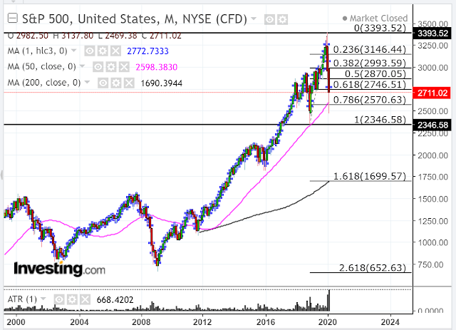
SPX Monthly chart (21st Century)
In any event, volatility is likely to remain extremely elevated in both directions for awhile, until we eventually see a new series of higher swing highs and lows form on the SPX daily timeframe.
The following SPX:VIX daily ratio chart shows that price is still well below 60 (at levels seen during the peak of the 2008/09 financial crisis), as well as 100. I’d like to see it recapture and hold above 100, at least, before considering the possibility that volatility is settling down somewhat.
Furthermore, price is under the bearish influence of a recently re-formed moving average Death Cross, the RSI has yet to retake the 50 level, and the MACD and PMO indicators have yet to form bullish crossovers. So, we’ll need to see reversals of those occur and hold, if price rallies to anywhere near 100, and beyond…and, if the SPX can retake and hold above 2750 and higher.
Otherwise, look out below!
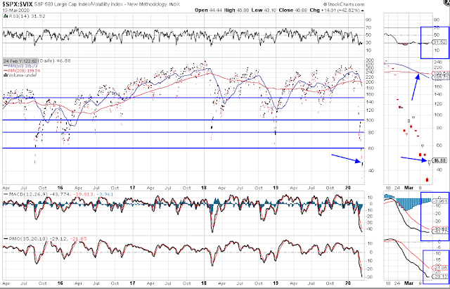
SPX:VIX Daily Ratio chart
